Overview
SuFo (Surgeons Forum) is a medical continued education platform owned by SugarSnap LLC, a Houston / Chicago-based medical education startup. SuFo hosts videos that physicians can watch to earn required Continued Medical Education credits (CME). Currently, SuFo has video content in the fields of plastic surgery and orthopedics, however, is in the process of forming partnerships with select associations to further expand their content categories.
The website initially created as a marketing landing page for funding purposes, required a major redesign due to a confusing and broken structure. My team’s task was to conduct research and usability tests on the existing site, as well as interview SMEs and users to then create wireframes that optimized the experience of CME learning for physicians.
Role
UX Researcher, IxD
Deliverables
Personas / Wireframes / Prototype
Tools
Sketch / InVision
Existing Website
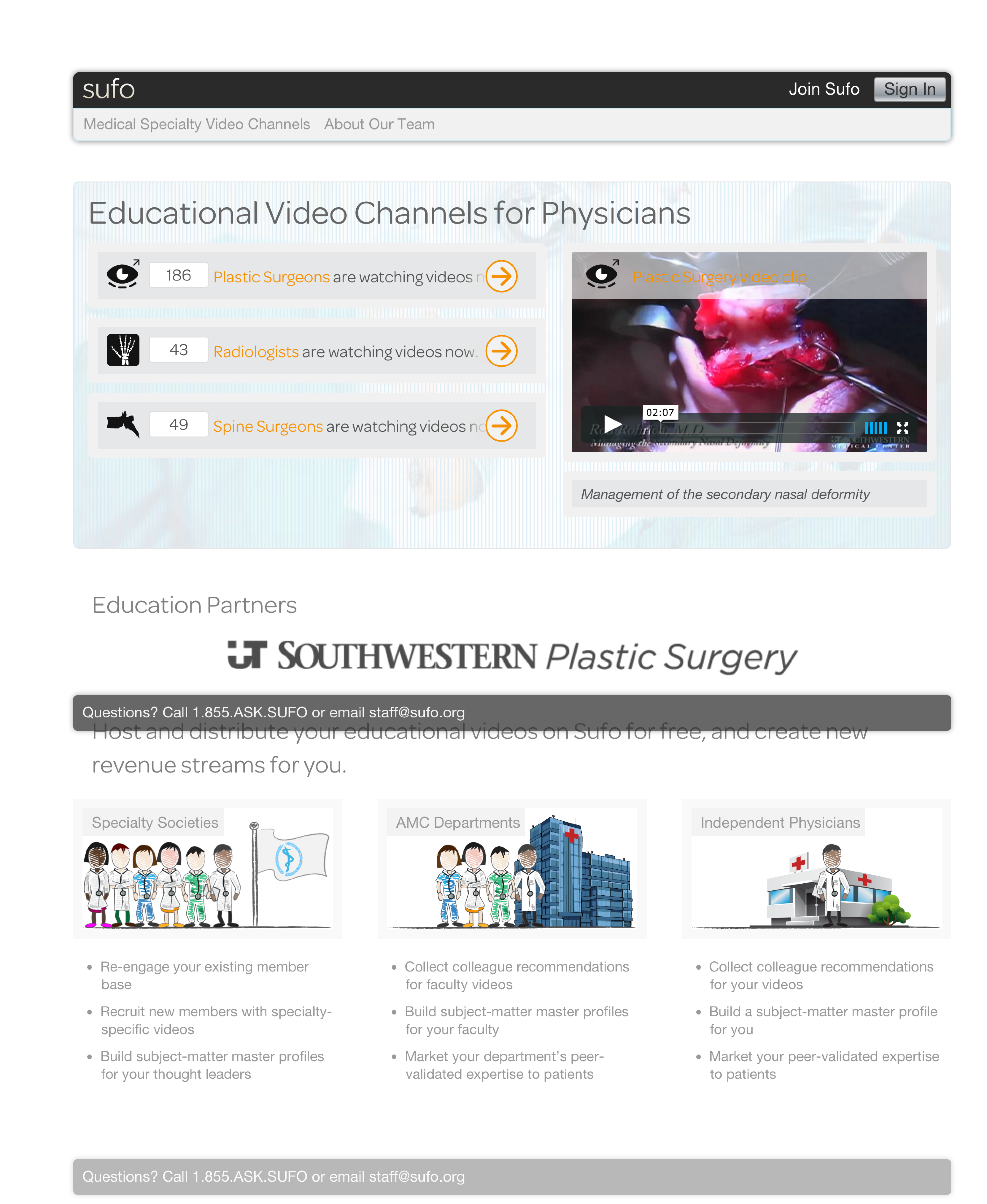
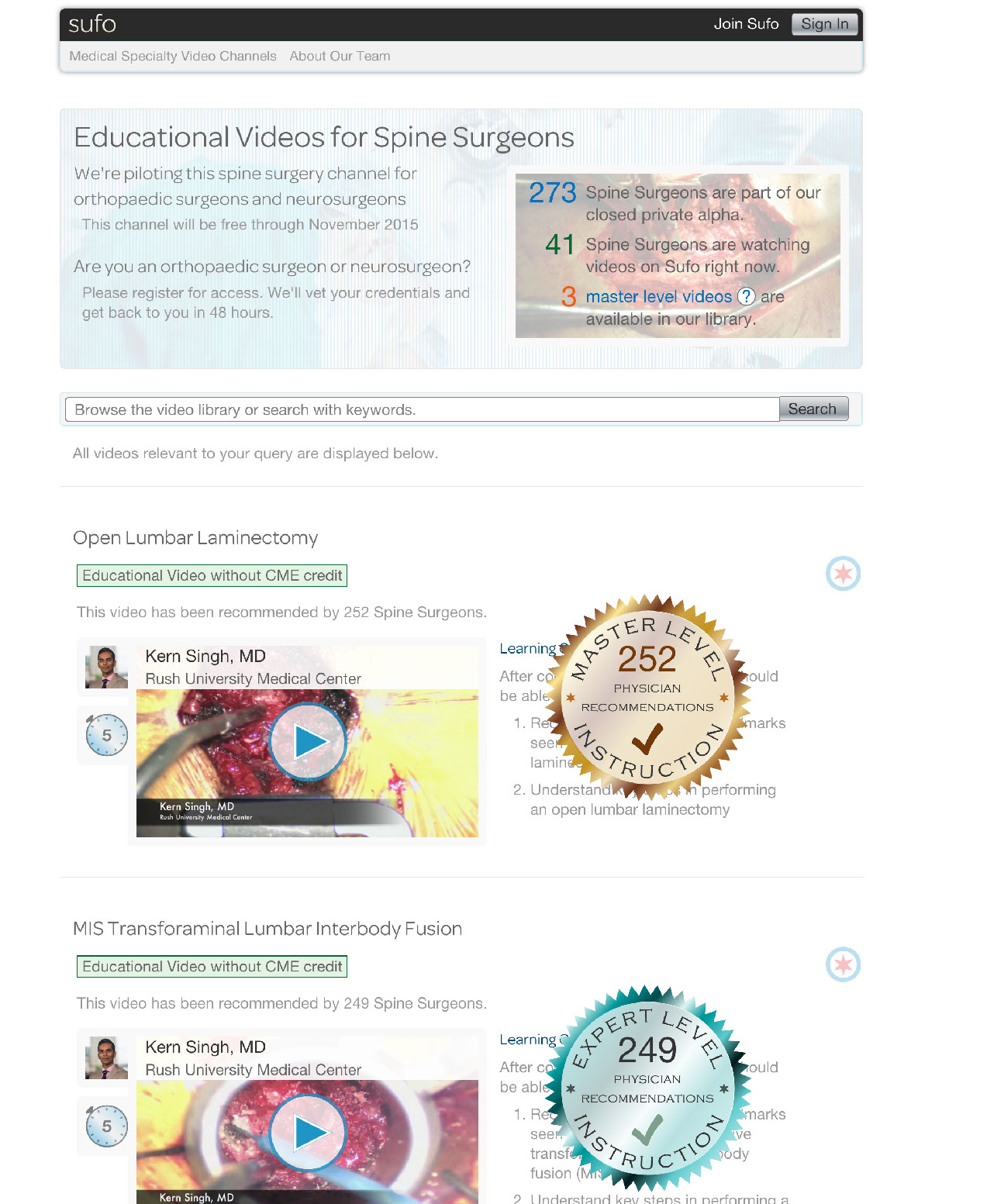
Below are photos of what the existing website looked like. Later in this case study, a sitemap visually pinpoints the key issues.


EMPATHIZE
Research
This project required a great deal of research as nobody on my team had any prior experience with any of the workings of CME accreditation or continued medical education. We conducted domain research, competitive analysis and spoke extensively with our client who was very knowledgeable.
SuFo's Model
In-depth conversations with the client helped us identify the three primary stakeholders in SuFo’s triangular business model: medical associations, pharmaceutical and medical device companies, and physicians. SuFo’s objective was to solve the lack of communication that currently exists between these important stakeholders and to become an intermediary between all of them. SuFo wants to solve the problem of decreased membership of the medical associations by providing them with their video content so that they would be able to attract CME seeking physicians to join, whilst allowing Medical Device and Big Pharma to advertise on their website (further explained in the graphic below).

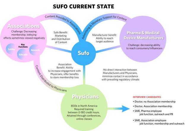
Domain & Competitive Analysis
We found out that there the current avenues for physicians to obtain CME credits was very scattered, and that there was space for SuFo to propose a better solution. There were various websites that also offered CME credits through video lessons, such as AuntminnieCME.com and Vumedi.com; however, none of them proposed to link medical industry companies, medical associations and physicians in the way that SuFo aims to.


User & SME Interviews
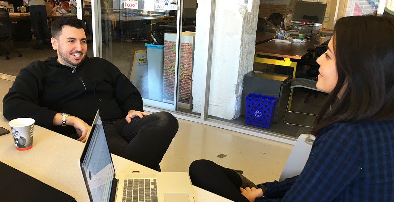
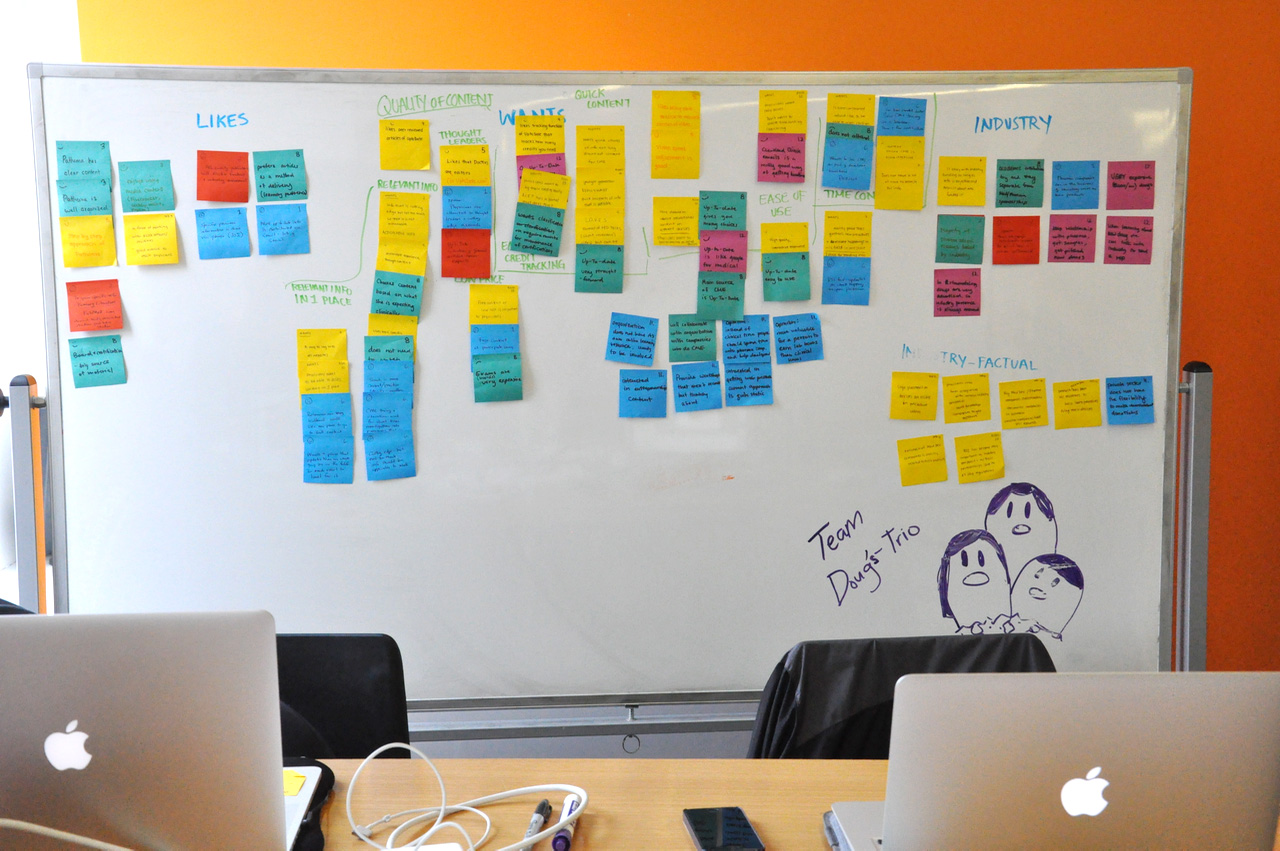
We conducted a total of 14 user interviews, 8 with physicians, 4 with medical device and pharmaceutical company representatives and 2 with medical association representatives. This information was recorded and aggregated through affinity diagramming which allowed us to distill our 2 primary personas (discussed later).
The main issues faced by physicians when getting CME credits were:
- Lack of time to devote to solely studying for CME
- Inconvenient timing and location of conferences
- Inability to easily track their credits

Heuristic Analysis
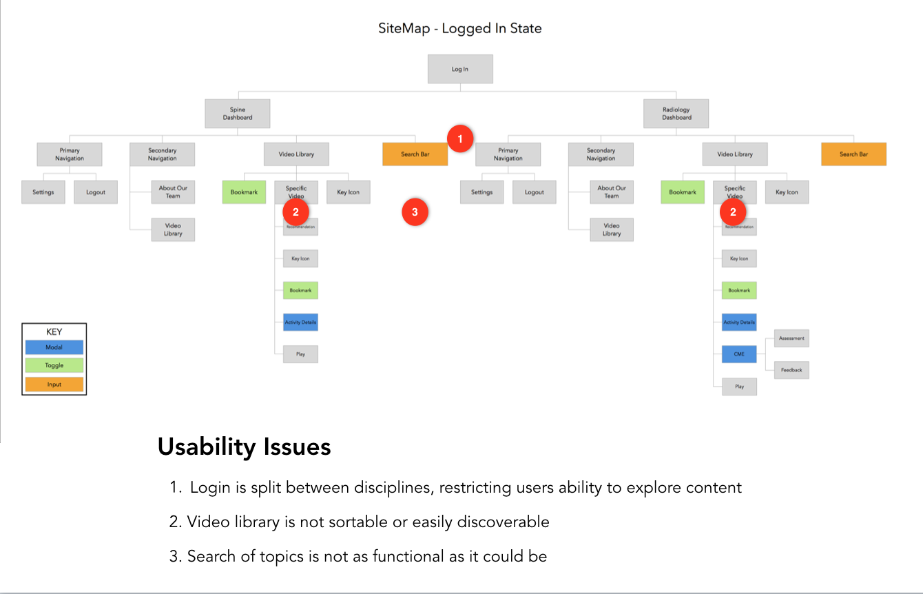
Each member of my team analysed SuFo’s existing website against Jakob Nielsen's 10 principles of Interaction Design to identify its problems. We then discussed our findings and identified the primary problems that we were going to prioritize in our redesign. The primary problems were:
Multiple logins that separated content of differing specialties
Many pages were incomplete and many links were broken
Inability for user to preview video
Inability of user to track CME credits earned
Site Map
In order to demonstrate to the client the issues that the existing site had, we created a sitemap for both the logged-in state, as well as the logged-out state to visually pinpoint where the problems were located.
DEFINE
Research Synthesis
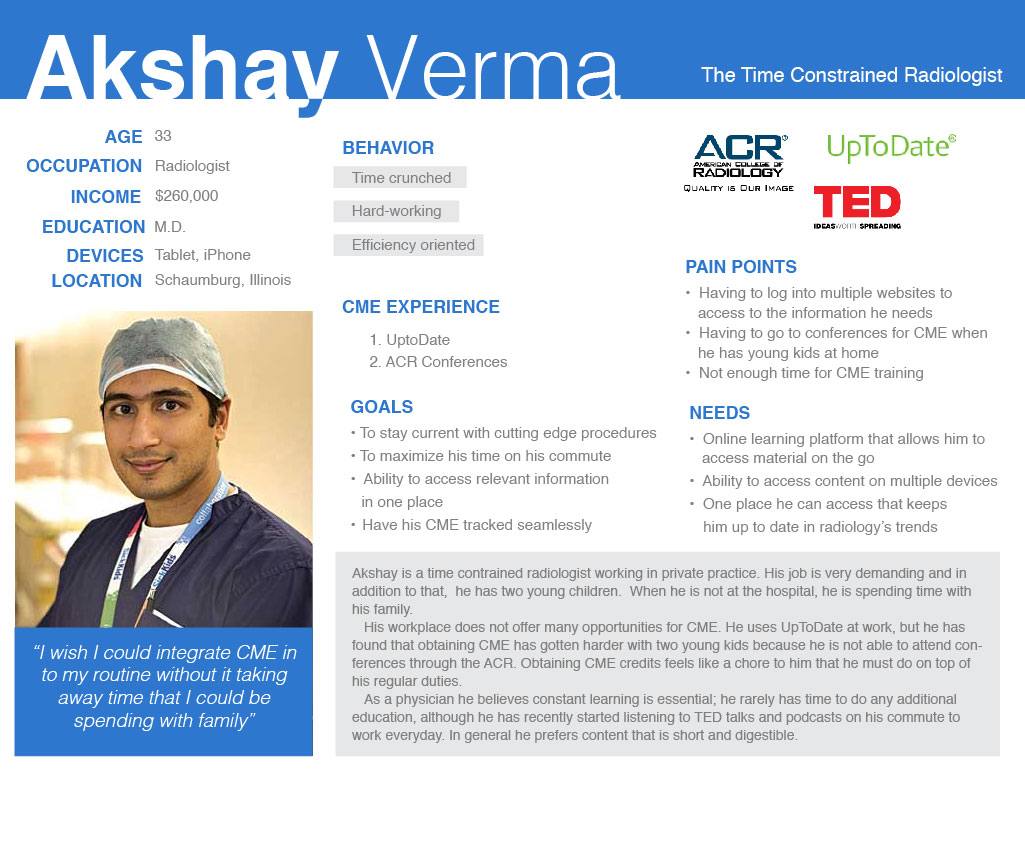
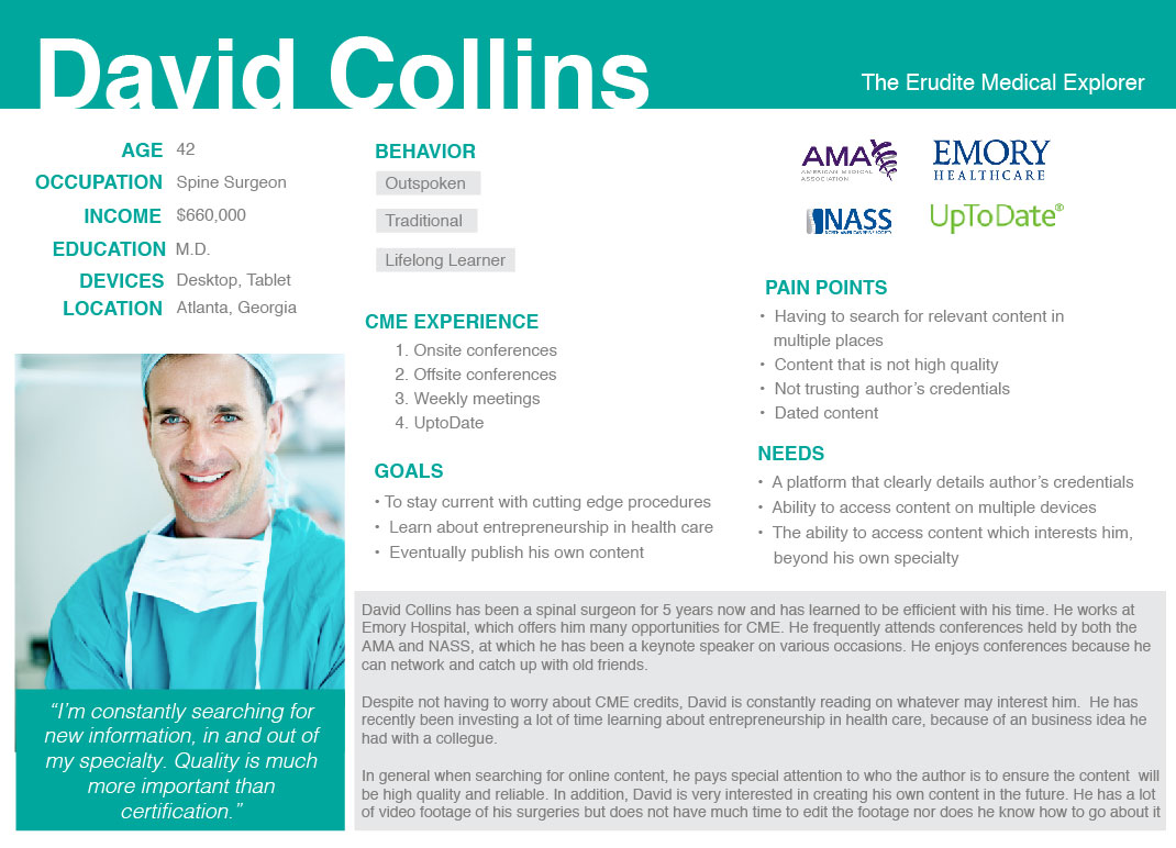
After conducting the research, my team then synthesized all of the data we had collected. As a team, we created an affinity diagram from our user interview data using hundred of post-its. We then created two primary user personas, Akshay and David.

The User
From all of our interviews, we were able to identify two primary user personas. The two primary users of SuFo was the younger physician, Akshay, and the established physician, David.
The Problem Statement
Physicians need relevant content that is easily accessible across a range of channels and formats to address the changing nature of the medical profession, while giving the flexibility to learn under multiple time constraints.
Design Principles
Only what you want to see: content should be curated to the physician so they spend less time searching for it and more time learning it
Anywhere is good: content should be accesible from multiple devices so that physicians have the convenience of learning on the go
Quality over quantity: Physicians choose content of a high caliber, by reputable authors
We keep track for you: CME credits should be tracked for the physicians so they can focus on the learning
IDEATE PROTOTYPE TEST
Our Solution
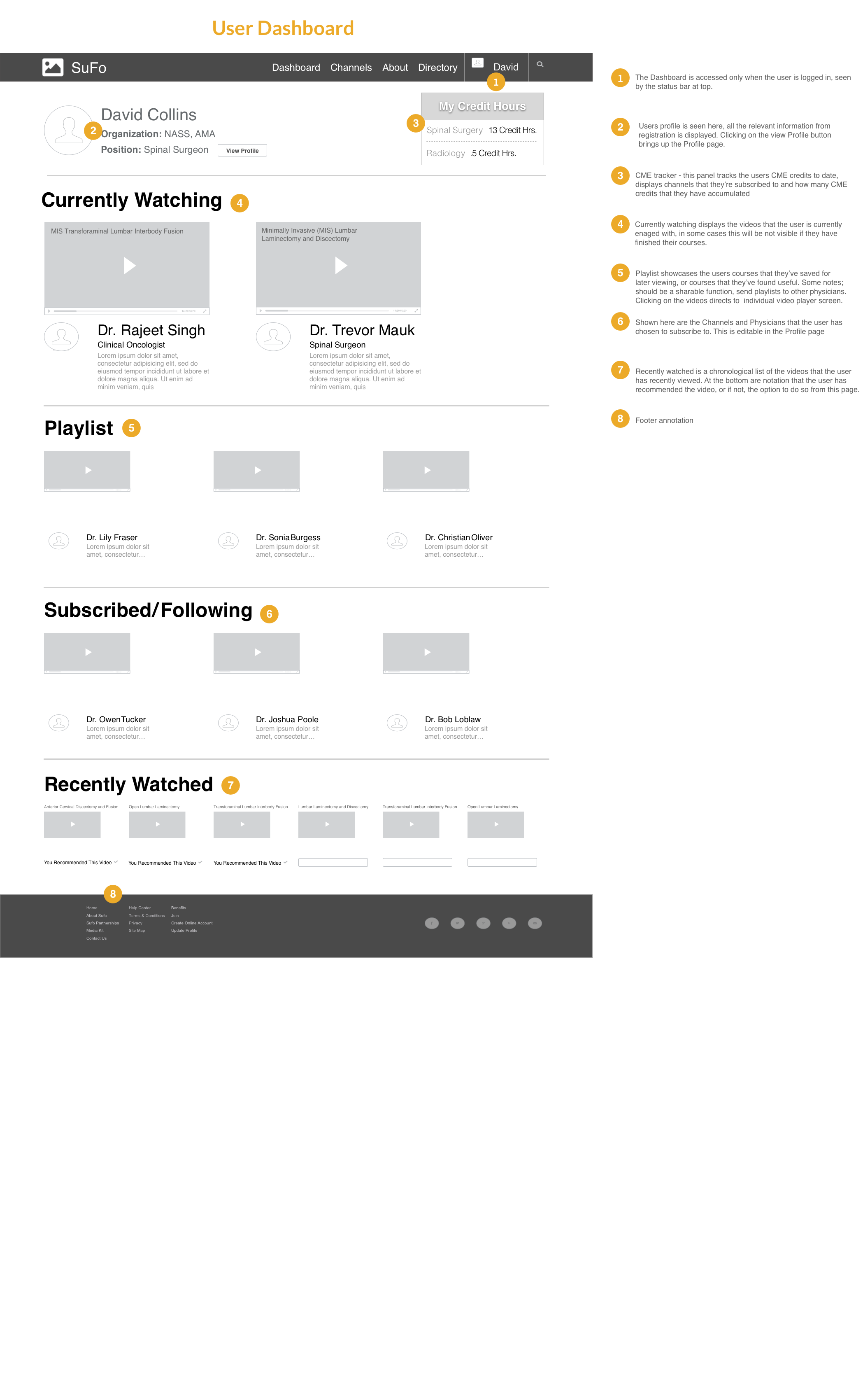
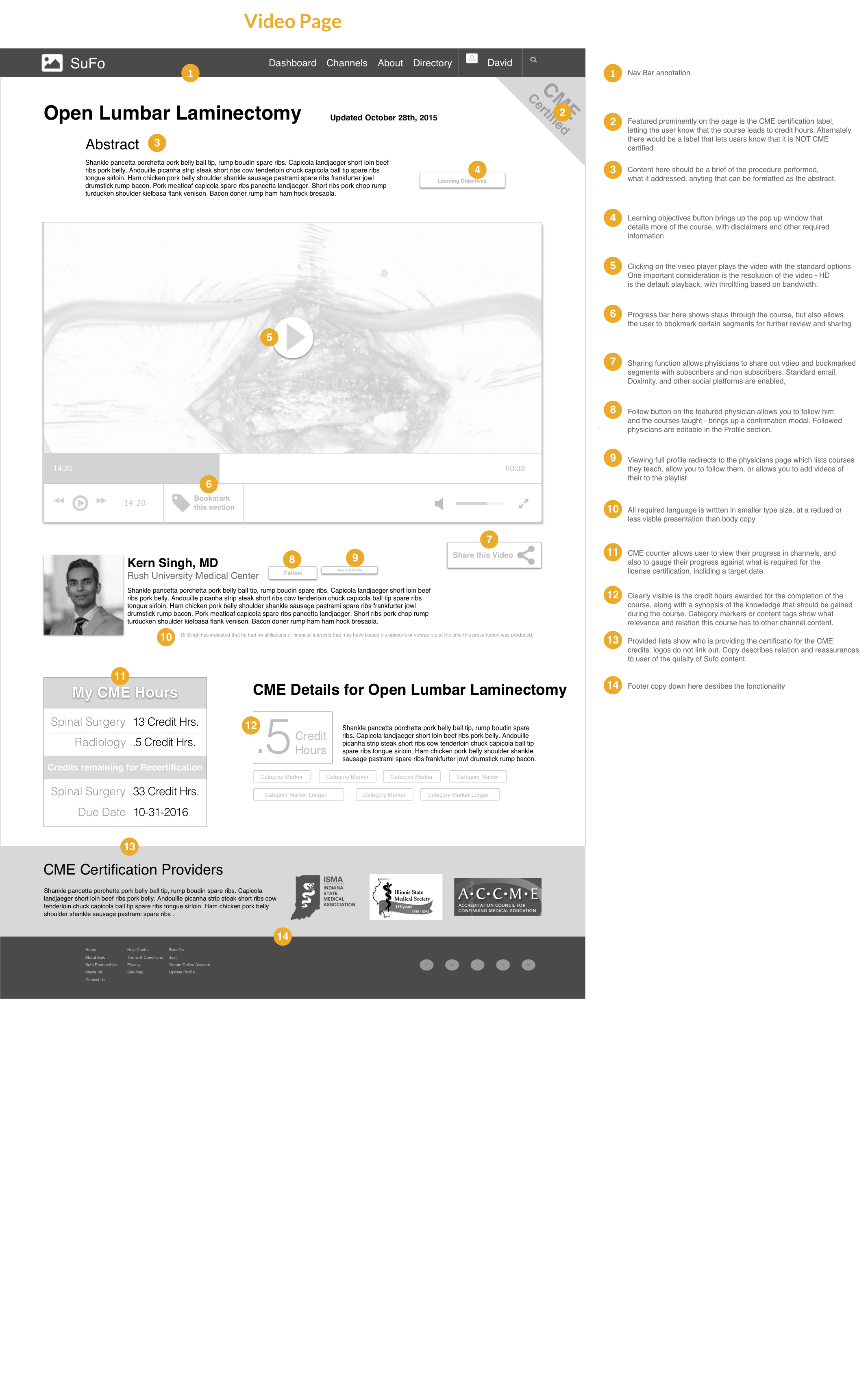
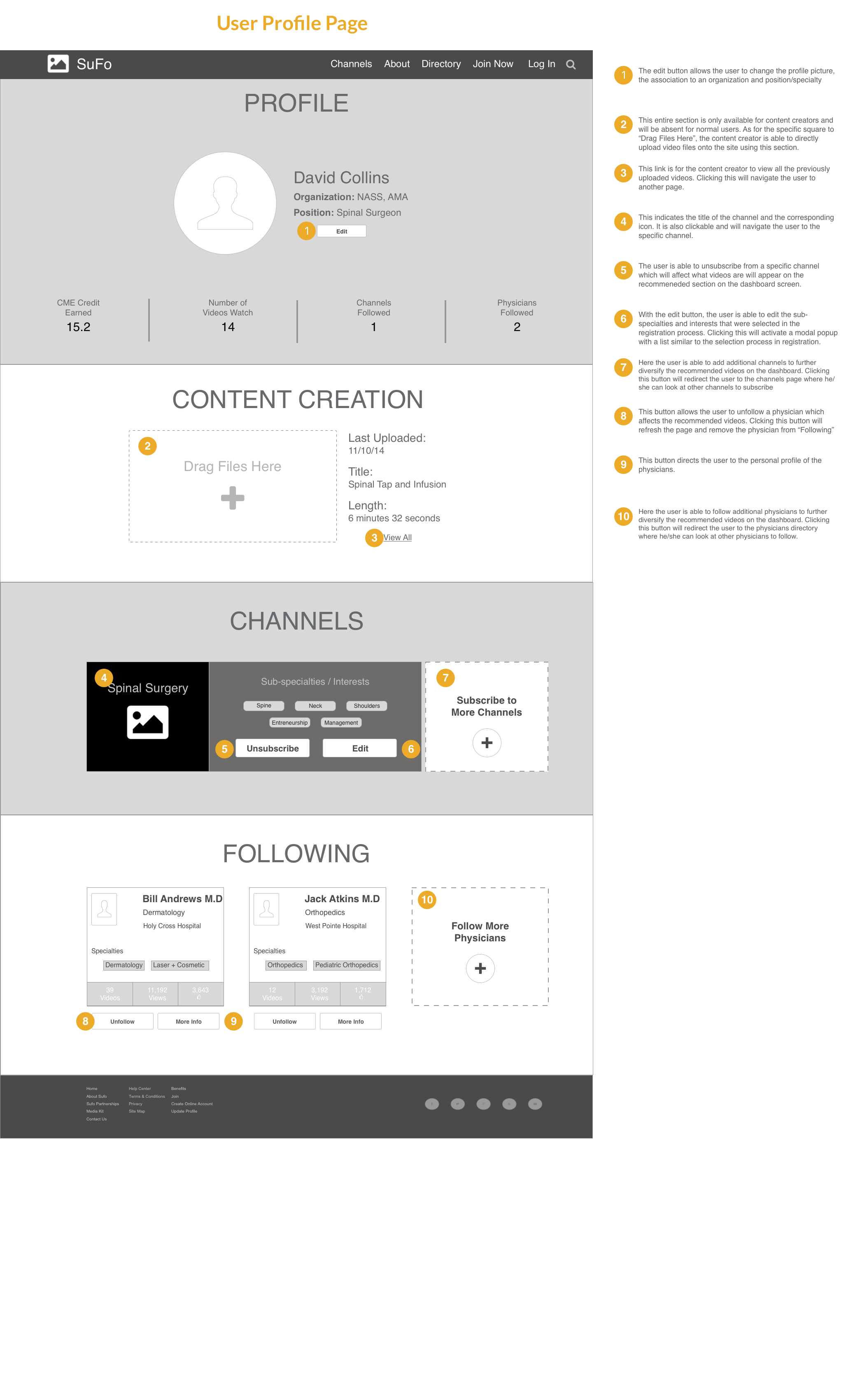
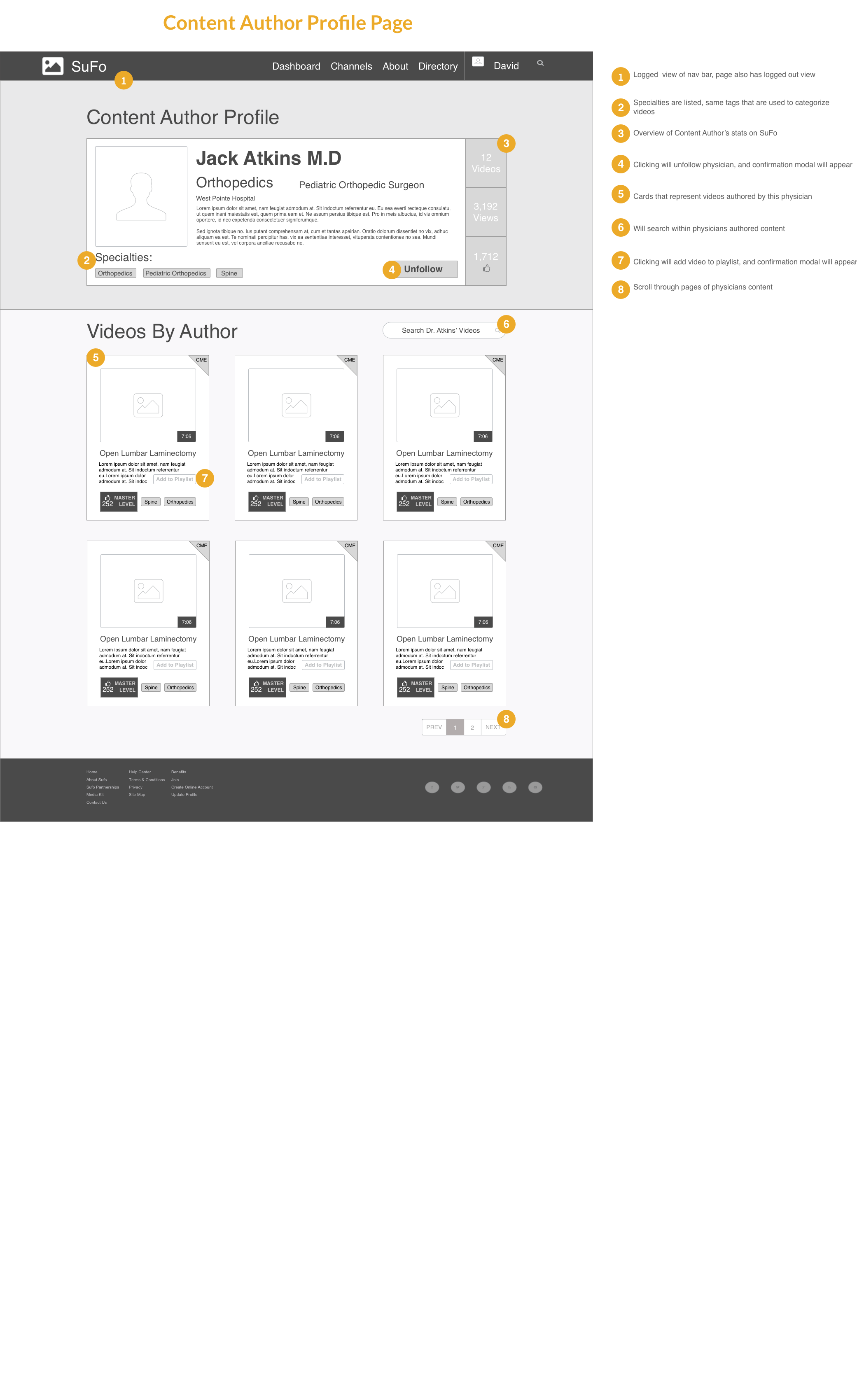
A platform that provided a more personalized experience for the physician. It will track their CME credits for them, curate suggested videos based on their preferences, allow them to follow content authors that they like and allow them to access the videos across multiple devices. Authors of the content would be highlighted and given a profile page where physicians could find their qualifications as reputation is very important.
Sketches and Concept Validation
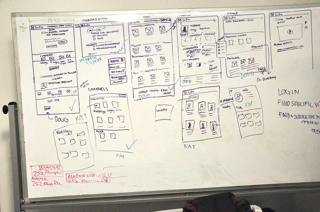
To start ideation, my team first completed a Google Ventures design sprint. We each sketched our own ideas on paper and concept validated our ideas. I was able to test my idea with a physician who happened to work in our coworking space; his feedback was positive overall however he had concerns regarding the implementation of sponsored content by medical device and big pharmaceutical companies.
After sketching and initial concept validation, we came together as a team to discuss our ideas. We eventually pursued my idea of a simple video platform that automated the CME tracking process.

Task Flows
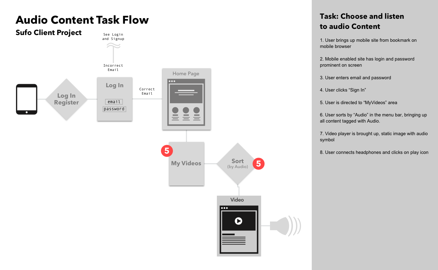
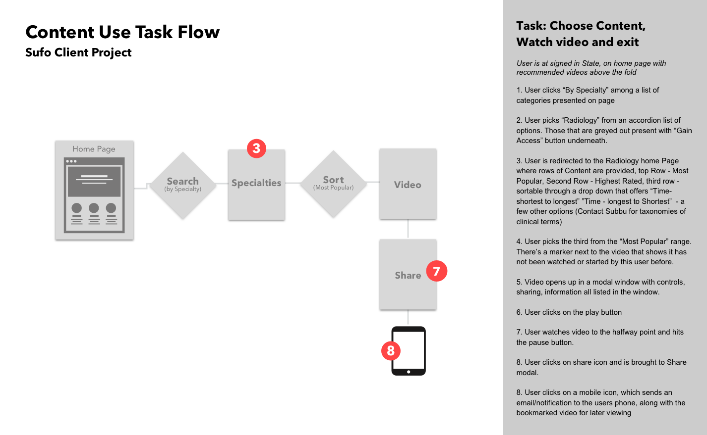
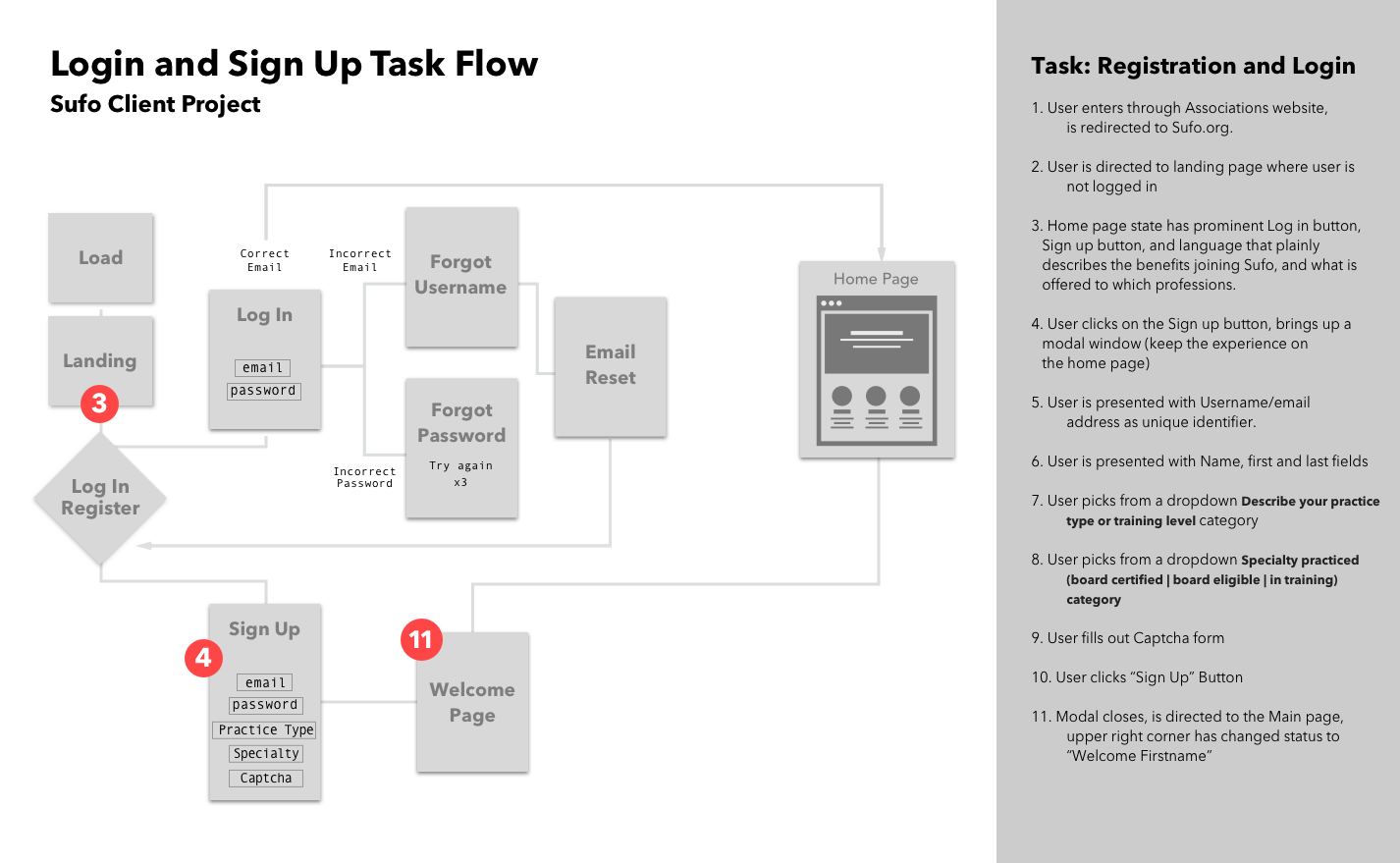
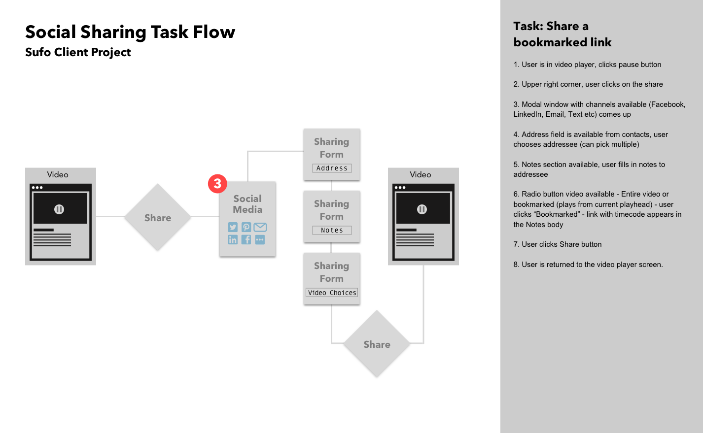
After our sketches, we created task flows that visualized the primary ways users would be using the site.
Wireframes
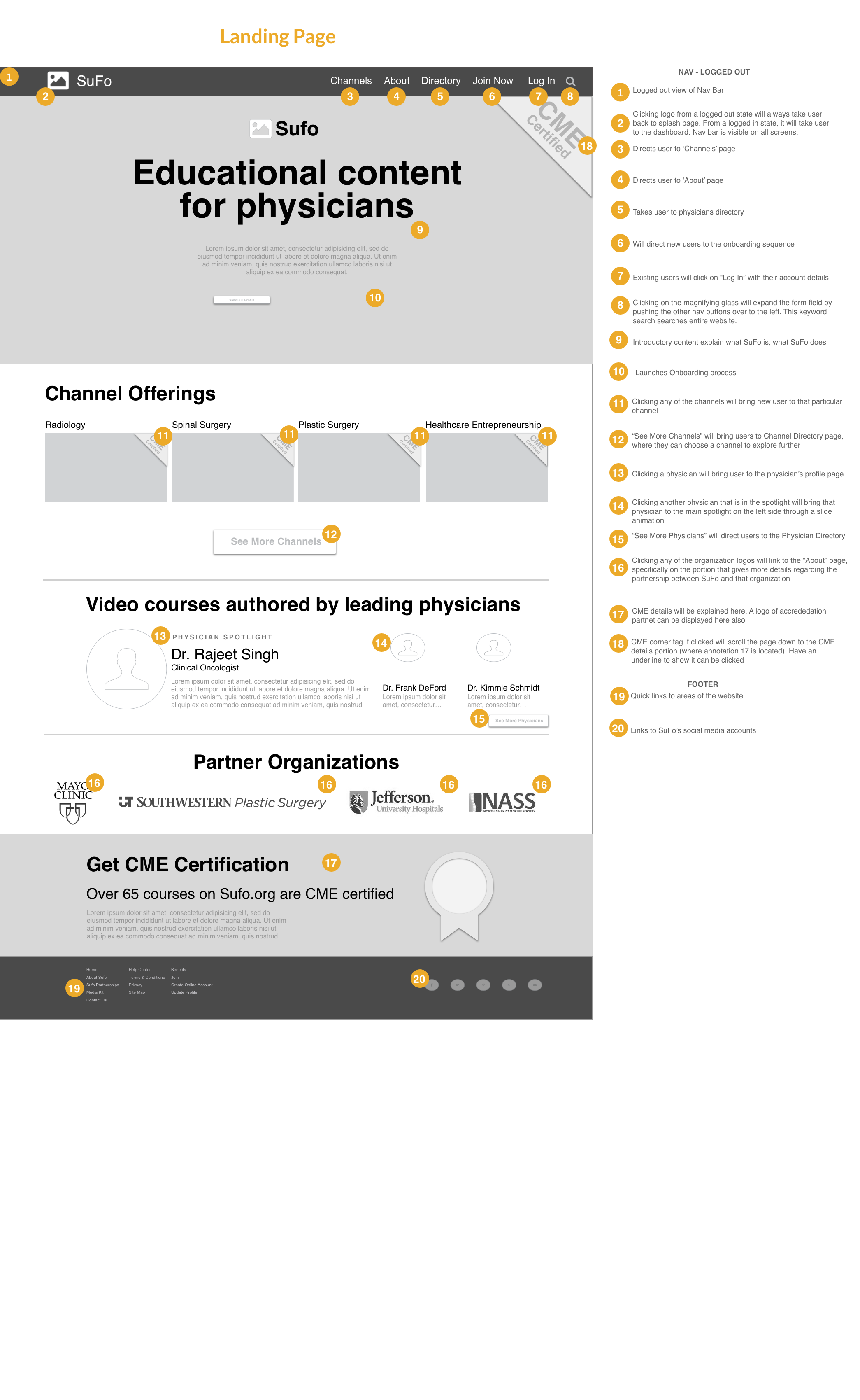
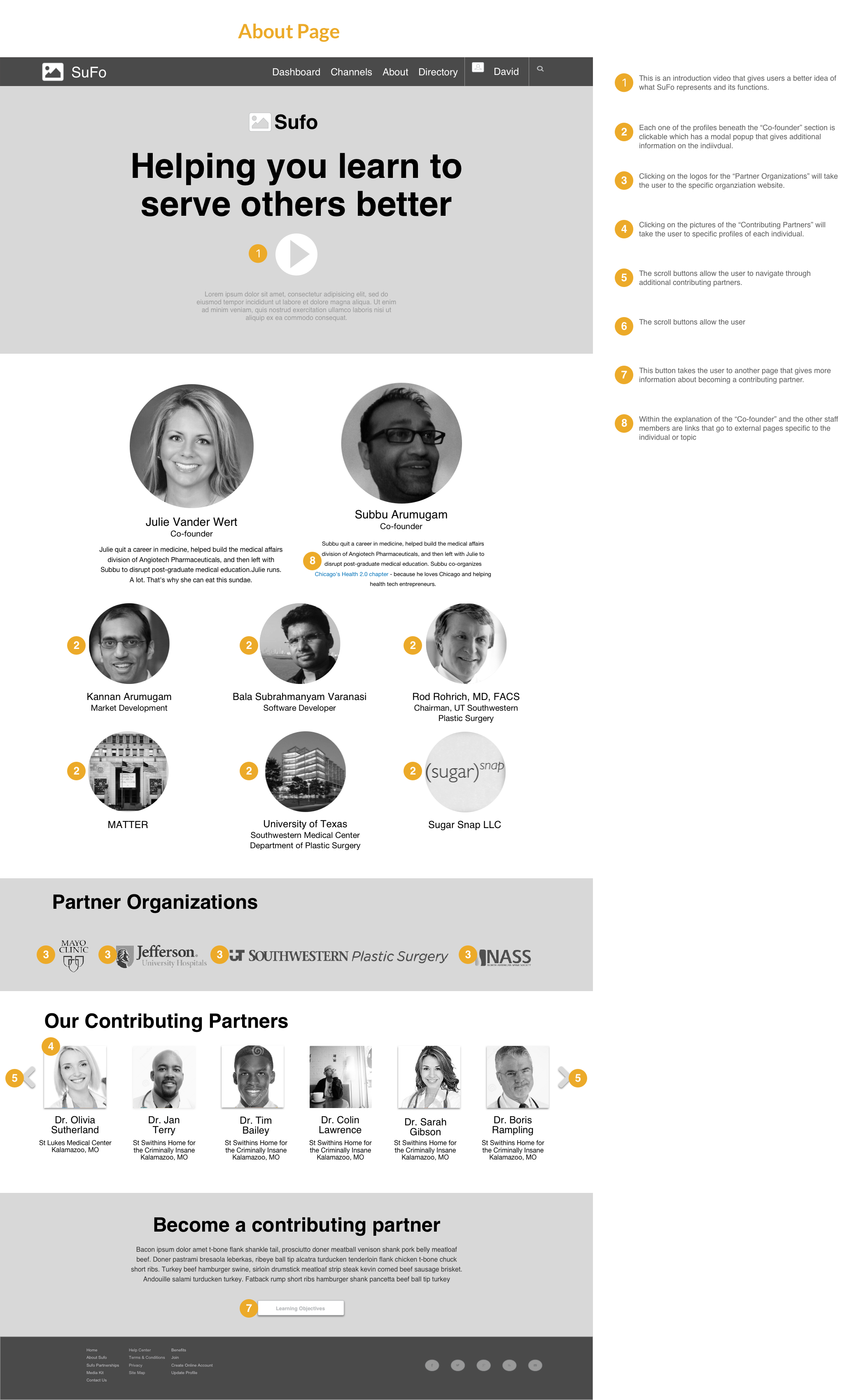
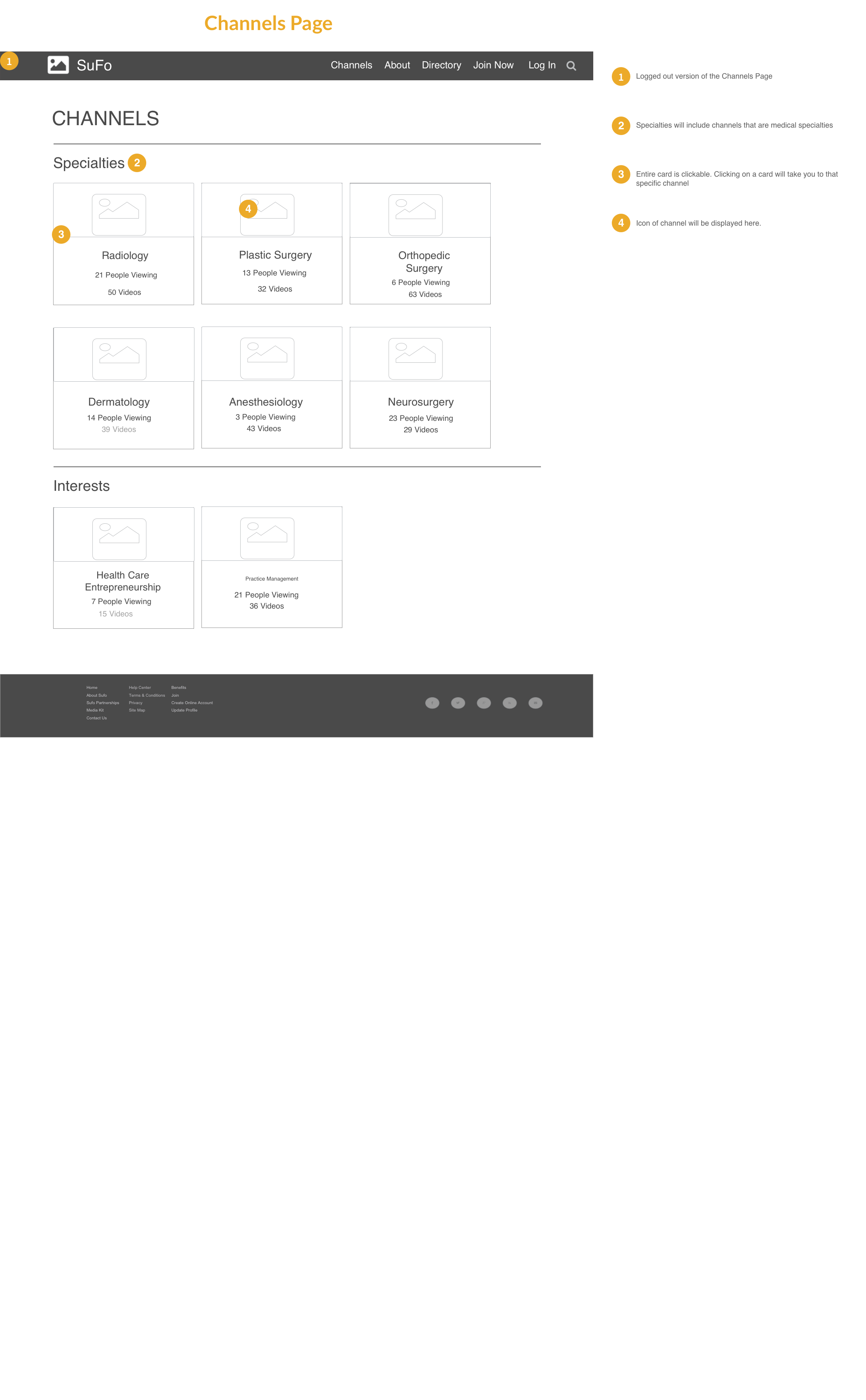
After considering the primary task flows, we took our sketches into wireframes. We prioritized the screens that composed our primary flows to ensure our usability tests were as effective as possible.
Usability Testing
After creating a prototype from our wireframes, we then usability tested our design. We tested it with 3 medical students, as we were unable to schedule times with physicians. Three main issues were:
- The sort functionality on the video directories created confusion
- Users did not have a clear idea of where to locate the content authors they were following
From our usability test results, we simplified the search functionality and organized the user profile page such that they would clearly be able to see what content authors they were following on a distinct section of the page. We used these wireframes to then create our prototype in Invision.
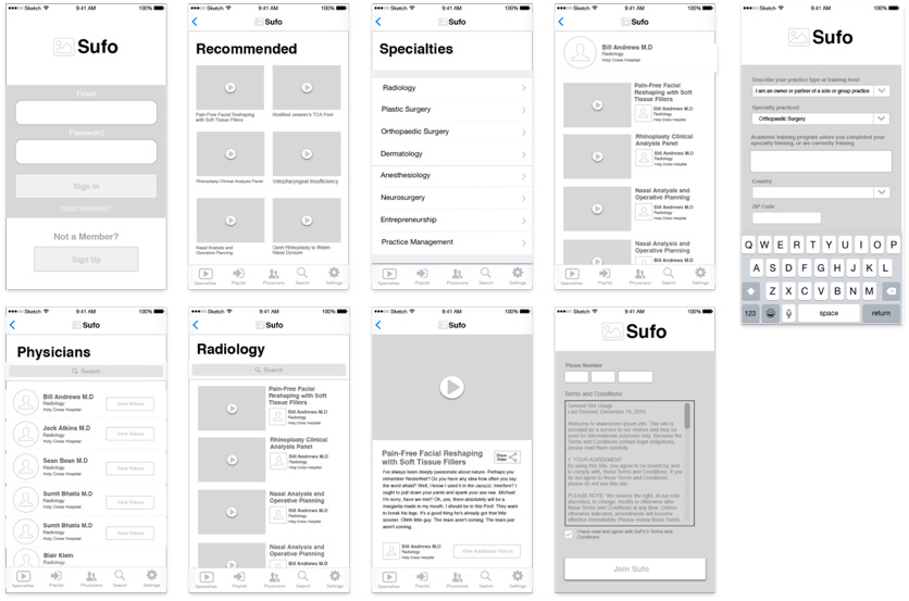
Mobile Wireframes
After completing the final browser width wireframes, we also created mobile wireframes because the ability to access content across devices was crucial to physicians.

Results
The client was very pleased with the project and the insights gained from the research. He had a better understanding regarding the issues his website initially had and what features interested users whilst simultaneously made his product more usable.
Next Steps
Regarding next steps, these are the areas I believe SuFo should focus on next:
Branding and UI : SuFo lacked any branding and will need to create a logo and strong brand that will be incorporated in the UI treatment of the website, to ensure that they are memorable and recognizable.
Information Architecture: As SuFo gains more content they must make sure that their information architecture is developed to preserve usability. Content must be organized to ensure that it is easy to access.


