
Overview
My team was given the task of conducting a visual redesign of Planet Lab, a subsidiary of Freedom Games. Planet Lab is a gamified social network for students K-12 to learn STEM subjects. Planet Lab crowd sources projects from a range of partners, including zoos, museums, environmental organizations and universities, that students are then able to contribute to through the online platform. They also partner with Chicago public school to get the projects they offer incorporated into their curriculums.
The primary goals of the project were to redesign the visual aesthetic of the website, as well as explore the design of “badges” that could be earned by students upon completion of projects.

Client

Role
UI designer, Rebranding

Deliverables
Style tiles / High fidelity responsive web mockups / Logo

Tools
Illustrator, Sketch
UI
Approach
The UI of the project included, rebranding, a redesign and the creation of high fidelity mockup pages.
My approach to visual design, similarly to the UX process, first involves research of competitors, as well as styles that appeal to the defined user groups. I then do an exploration of potential styles through moodboarding and style tiles. After talking to stakeholders regarding their preferance of style tile and, if possible, being able to get feedback from users, I choose a final visual direction to pursue.
VISUAL RESEARCH
Visual Competitive Analysis
To start we had in-depth conversations with the clients to gain a better understanding of their overall vision for their product. We found that although they were targeting student from K - 12, their primary audience were 3-5 graders. They also told us that they were using a WordPress LMS, which I then had to research for any limitations it would entail in the visual redesign.
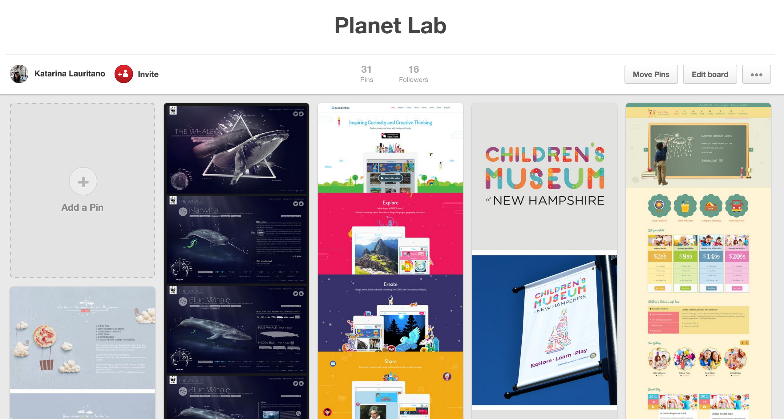
I created a Pinterest board to get an idea of what visual styles competitors in the children’s E-Learning space were using. I found that children's websites were all very colorful. It seemed the younger the target audience, the less copy and more bright illustrated elements were used. Rounded edges were a popular choice for UI elements, adding to the friendly and inviting interfaces.

VISUAL EXPLORATION
Rebranding
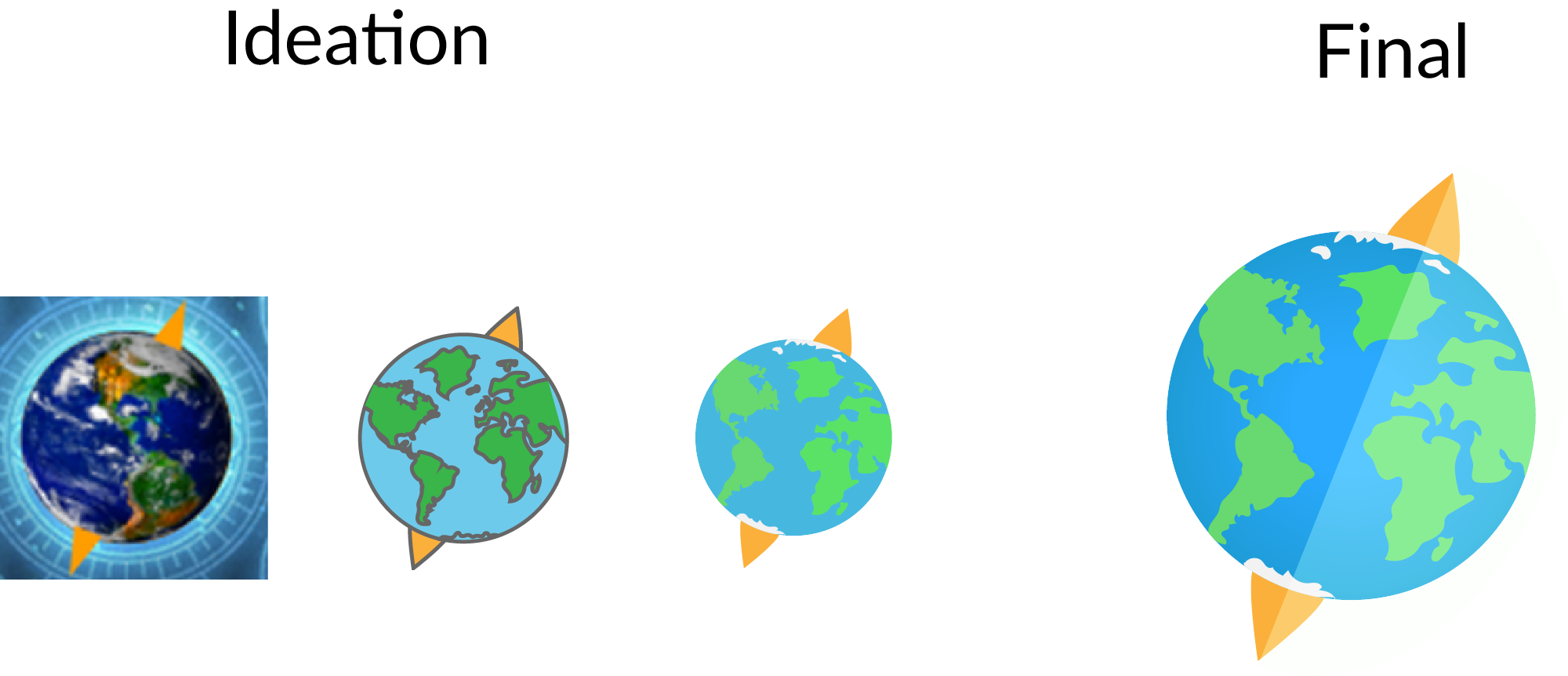
Our client did not have any wireframes available initially, so while we waited for them to provide us with wireframes, I took the opportunity to do some rebranding for them. The client was quite attached to their original logo premise of a globe and compass, so I redesigned it to fit the illustrative look I intended to pursue in my final design direction.
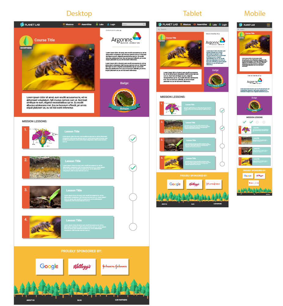
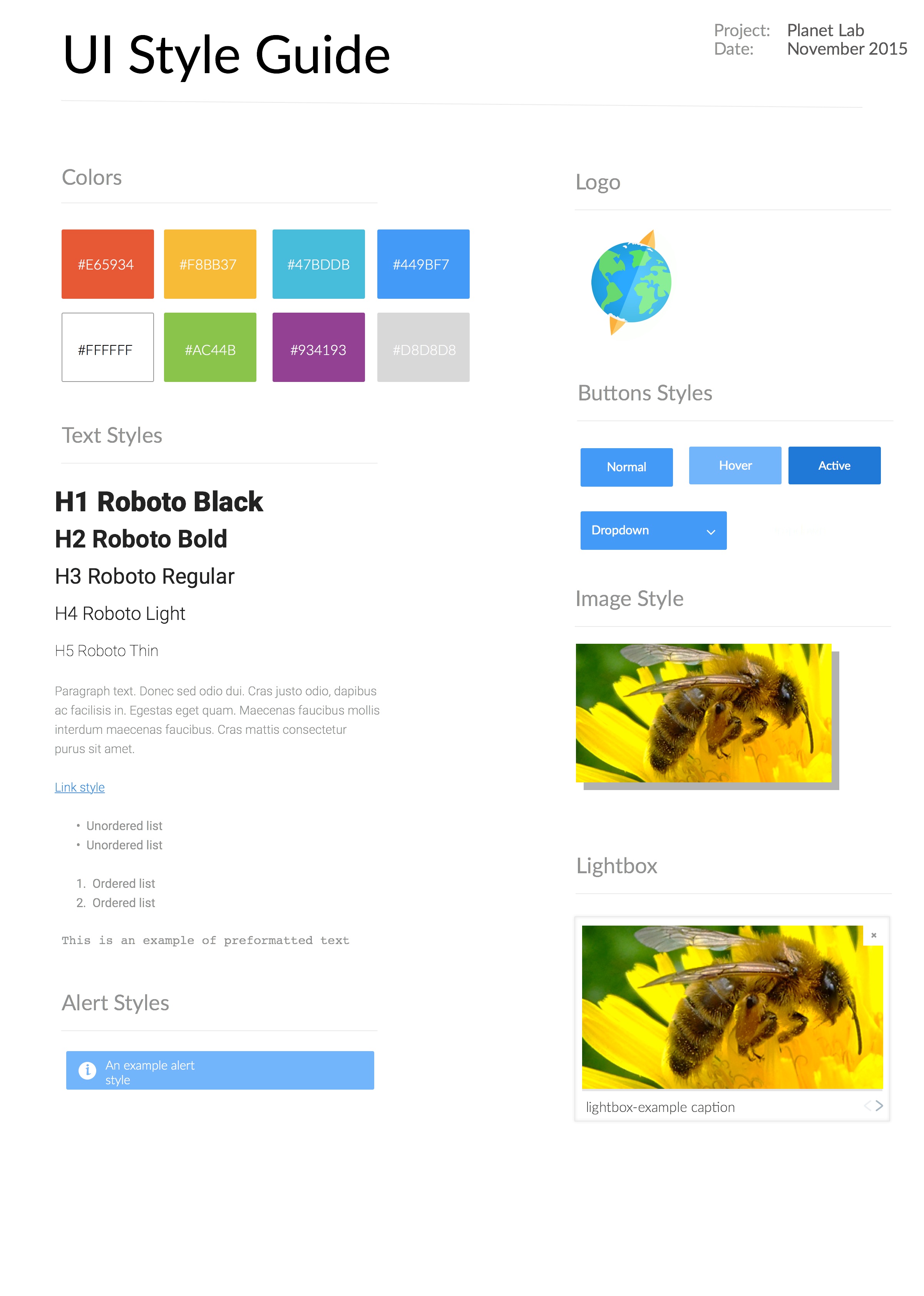
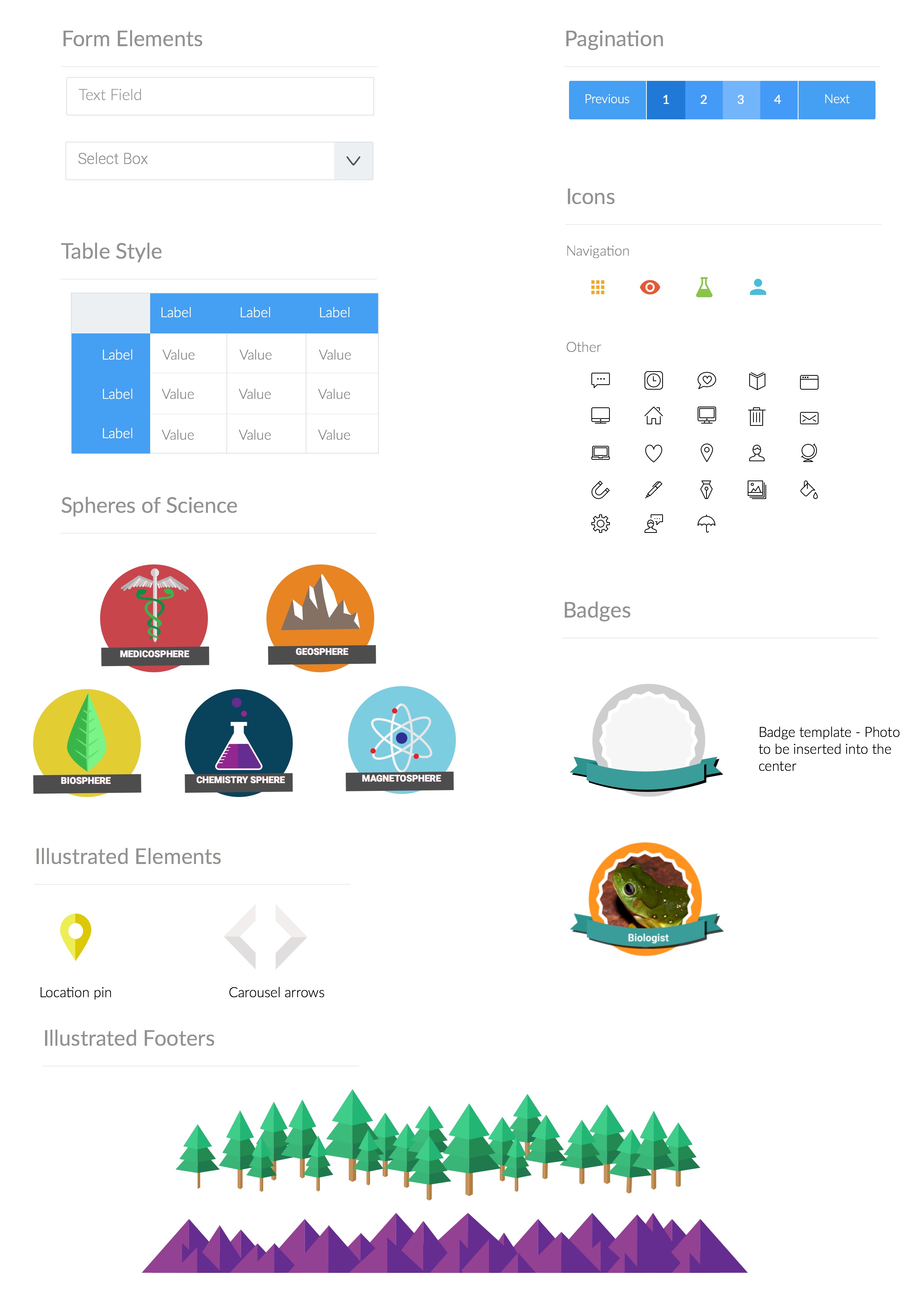
I also considered the badges that they wanted to implement through the gamification of their platform. They wanted the badges to be modular so that content providers could easily make their own. I decided that having a photographic badge with an illustrated frame was the happy medium. Content providers could place their own images into the badge template.

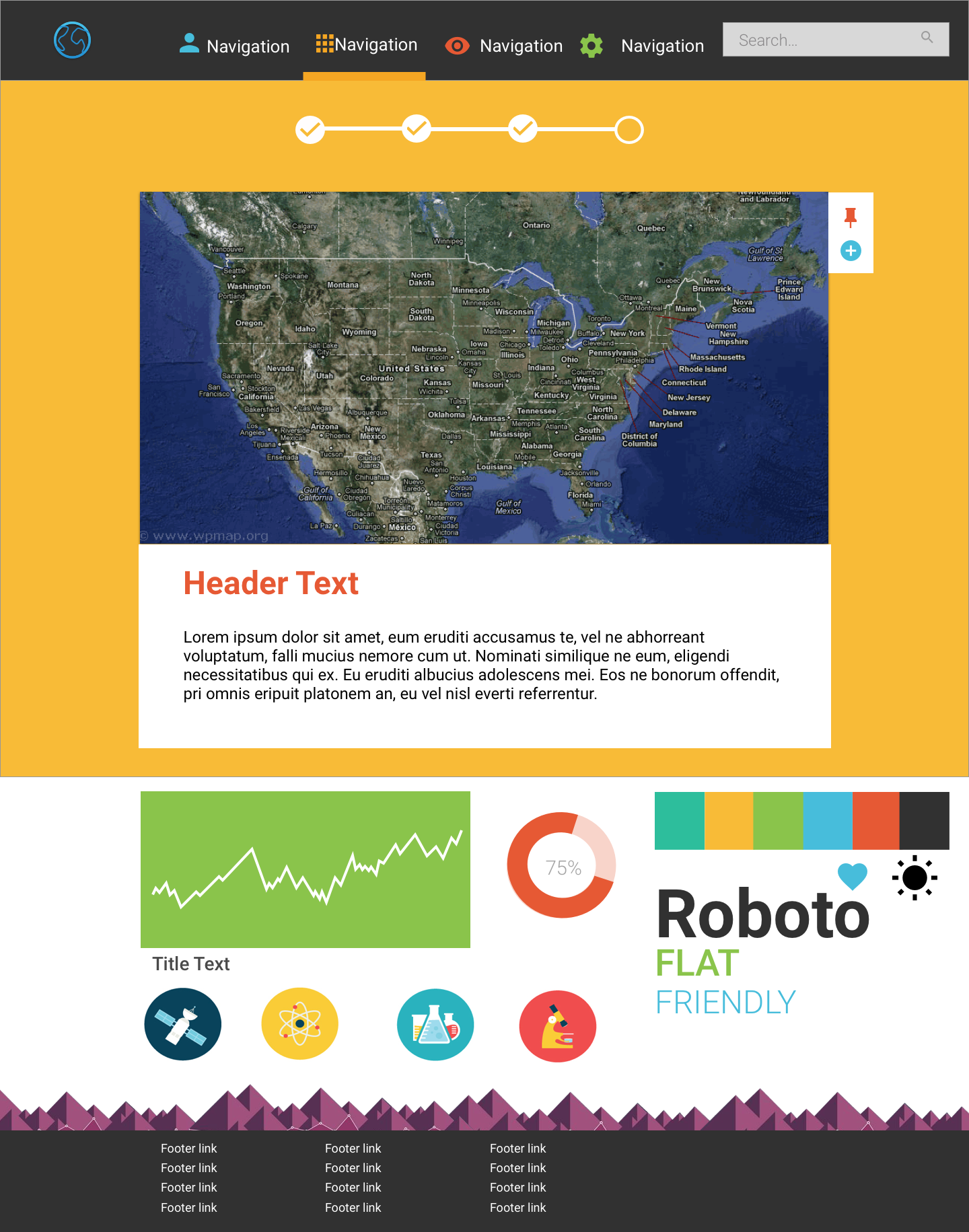
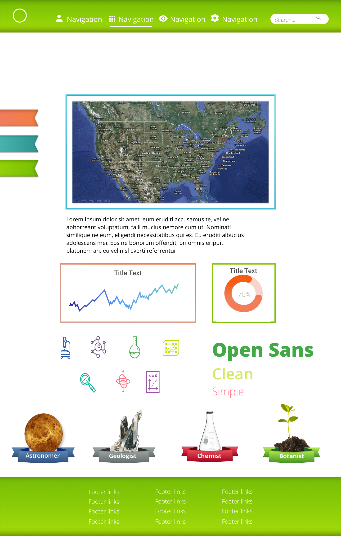
Style Tiles
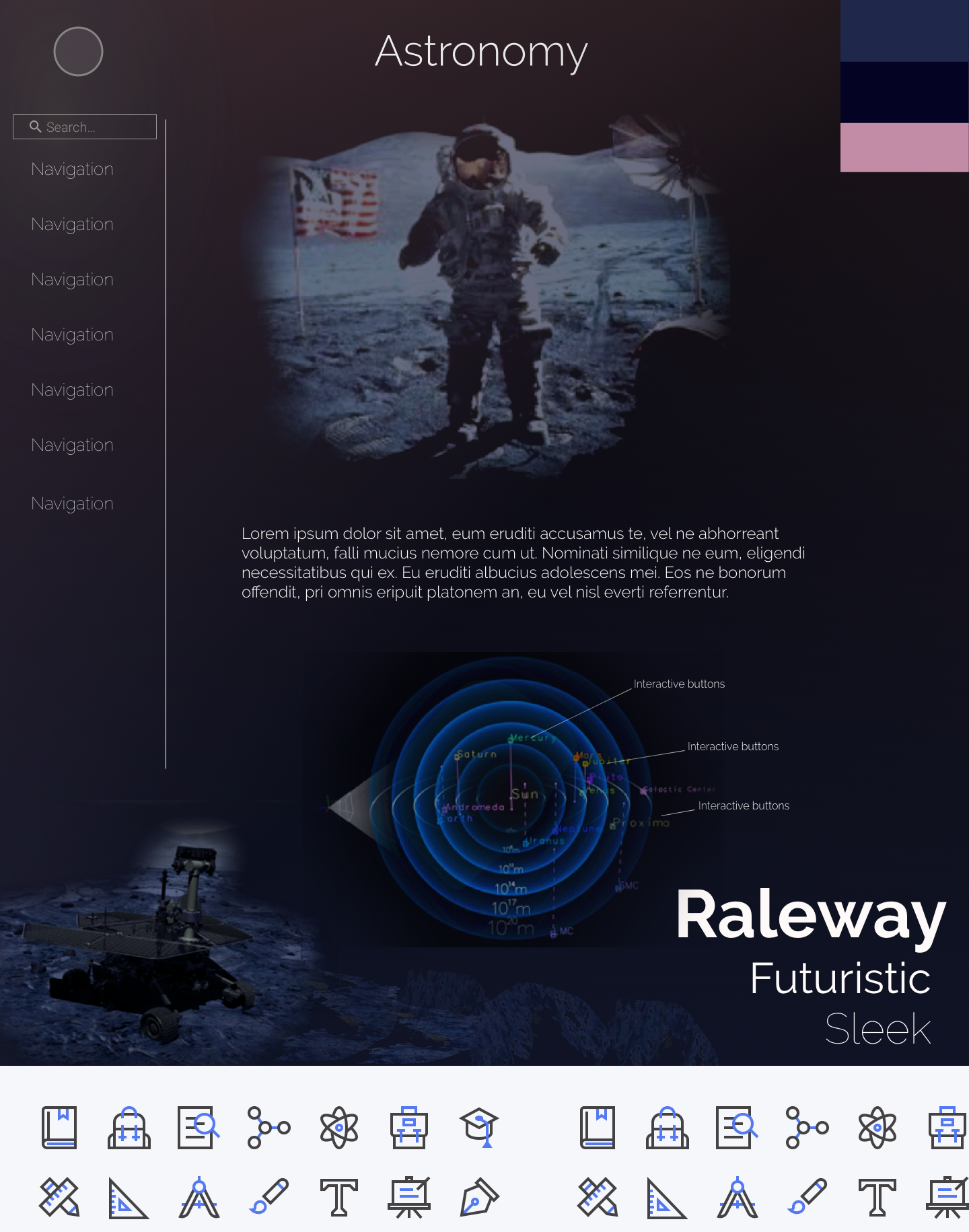
I created 3 style tiles that pursued different directions. I presented these to the clients, who were able to point out elements that they liked and didn’t like of each design. Ultimately they wanted to go with the illustrated look of Design 1 but wanted to keep elements of design 2 such as the photographic badges. I agreed with this because it would make the badges modular making it easier for content providers to create their own.


STYLE EXECUTION
High Fidelity Mockups
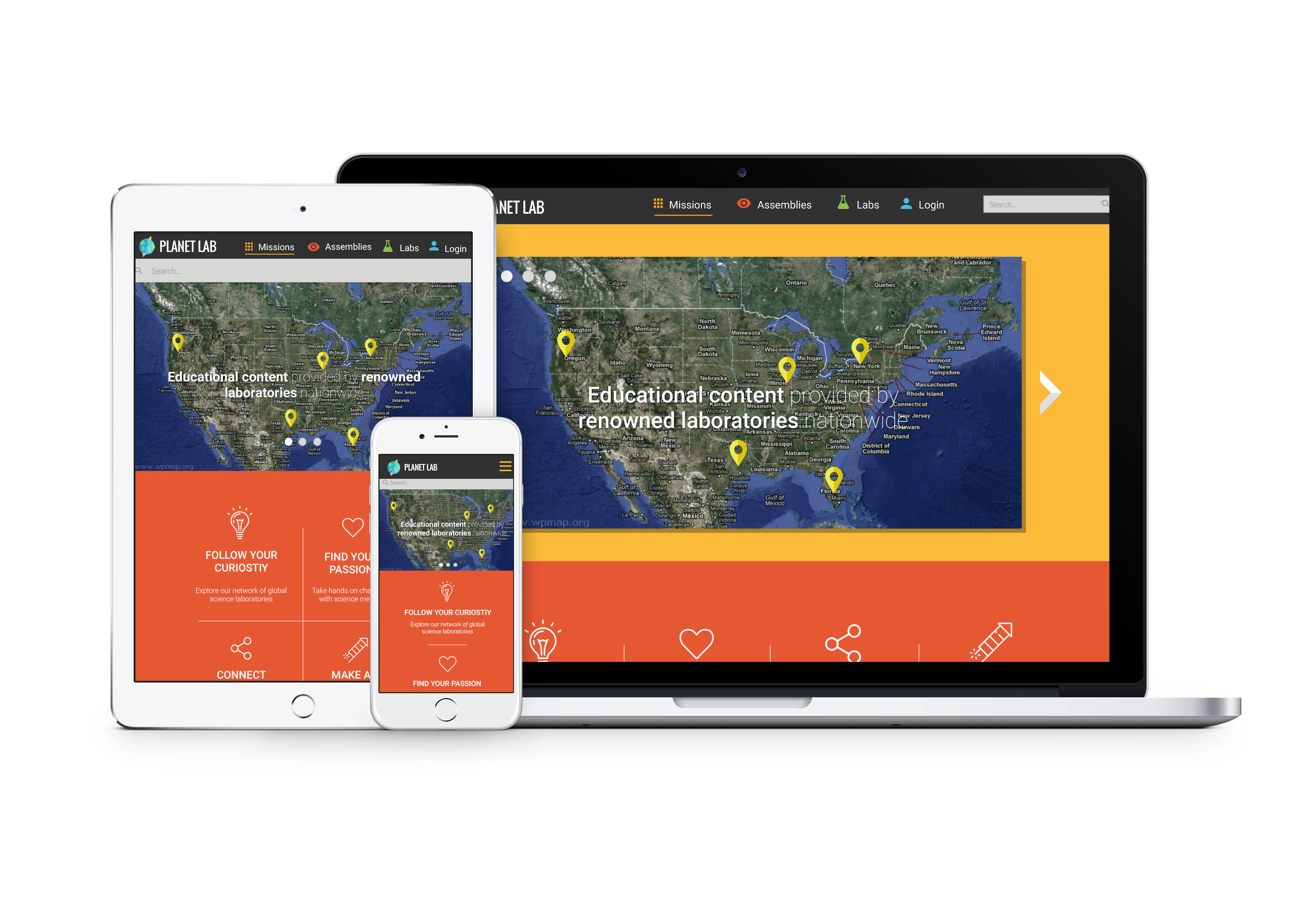
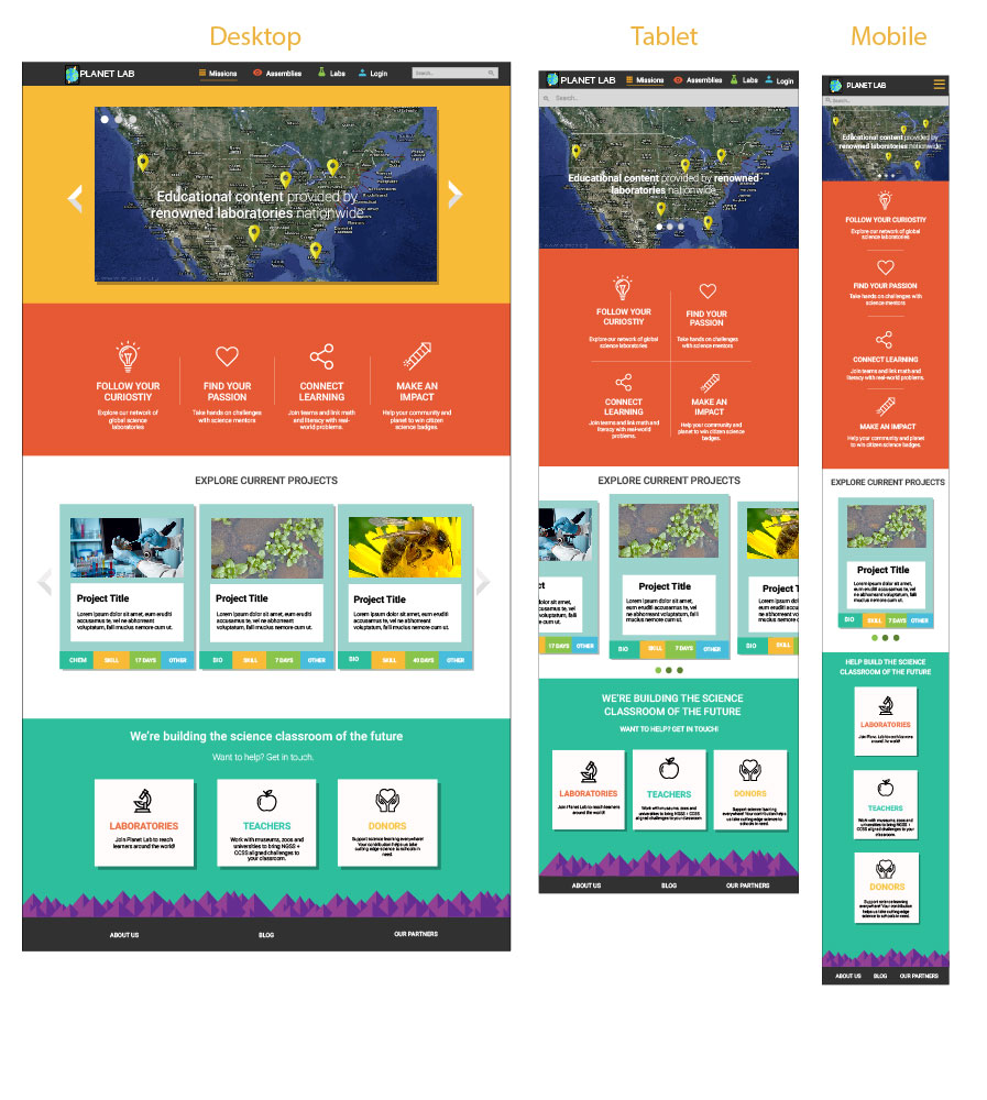
After getting the feedback from the clients regarding the aesthetic they wanted to pursue I was able to skin the two wireframes that were provided to us. Because the amount of pages to skin were limited, I then designed the responsive layouts for each page for tablet and mobile. I also illustrated a few of their project genre buttons. I then updated their logo to fit the aesthetic of my redesign.


Style Guide and UI Kit
Finally, I created a comprehensive style guide and UI kit that defined the visual design guidelines for our redesign.


“Design is so simple. That’s why it’s so complicated.” – Paul Rand
© 2021 Katarina Lauritano