
Overview
lynda.com is an online education platform offering thousands of video courses in software, creative and business skills. lynda.com was recently acquired by LinkedIn as part of their effort to close the skills gap that currently plagues the workforce and to further cement its position in the jobs space.
As part of an exploratory project at DESIGNATION, my team was tasked with the redesign and rebranding of the lynda.com website. Our process included user interviews, UX flows, wireframes, prototypes and UI design.

Client

Role
UX Researcher, UI Designer

Deliverables
Personas / Wireframes / Prototypes / High Fidelity Mockups

Tools
Photoshop, Axure, Invision
UX
Approach
As with all of my work, a design thinking approach was used with this project. 'Empathize' involves understanding the user and the problems that they face, 'Define' involves pinpointing the problem to be solved through the redesign, as well as defining who the target user(s) are, 'Ideate, Prototype and Test' is where solutions are thought of, taken to prototypes, and tested upon to rapidly iterate and improve upon them.

EMPATHIZE
Research
Following an agile approach to this project, my team first created a research plan that included both qualitative and quantitative research methodologies.

Quantitative Research
Before conducting our user interviews and domain research, we created an online survey that was sent to people who have had prior experience with online learning. This survey allowed us to glean demographic information, as well as the context and motivations behind their online learning experiences. We had a total of 131 survey respondents.

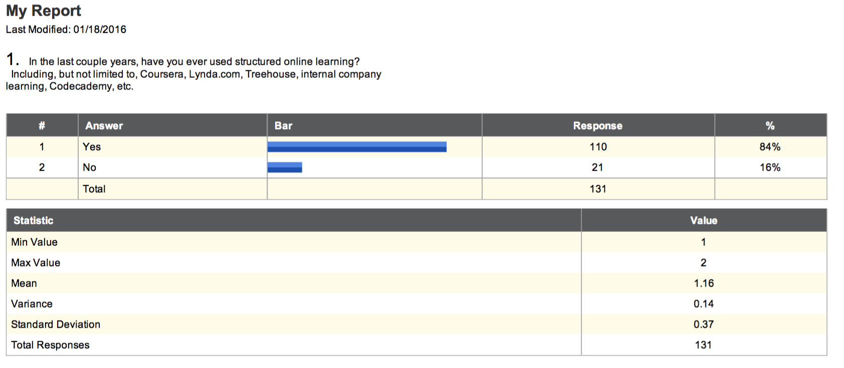
Key insights included:
E-Learning is more popular amongst users aged 20-40 years
Most users did not complete their courses
Many users use online learning to advance their careers
Other users utilize online learning as a way to pivot their career path
Users are willing to pay for courses that are well-regarded
Most competitors follow a tiered subscription model
Qualitative Research
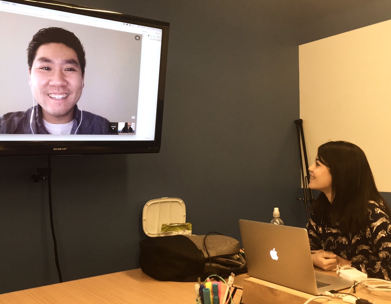
Our team conducted a variety of qualitative research methods to gain further insight into actual student experiences, to identify the biggest frustrations users currently face, as well as to analyze competitors in the e-learning space. In addition to domain analysis and competitive analysis, we conducted 23 user interviews.

Key Insights included:
- Current platforms have a lack of interaction with instructors
- Platforms with student interaction are more engaging
- Courses affiliated with universities or established companies are more trusted
- Users want to learn information that is applicable to the real world
Key Challenges

DEFINE
Research Synthesis
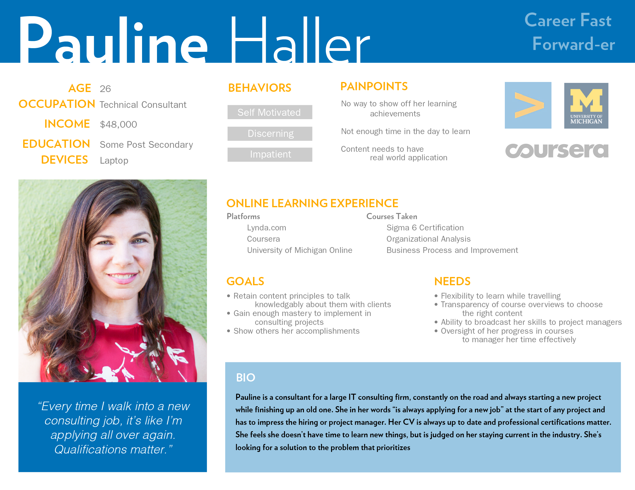
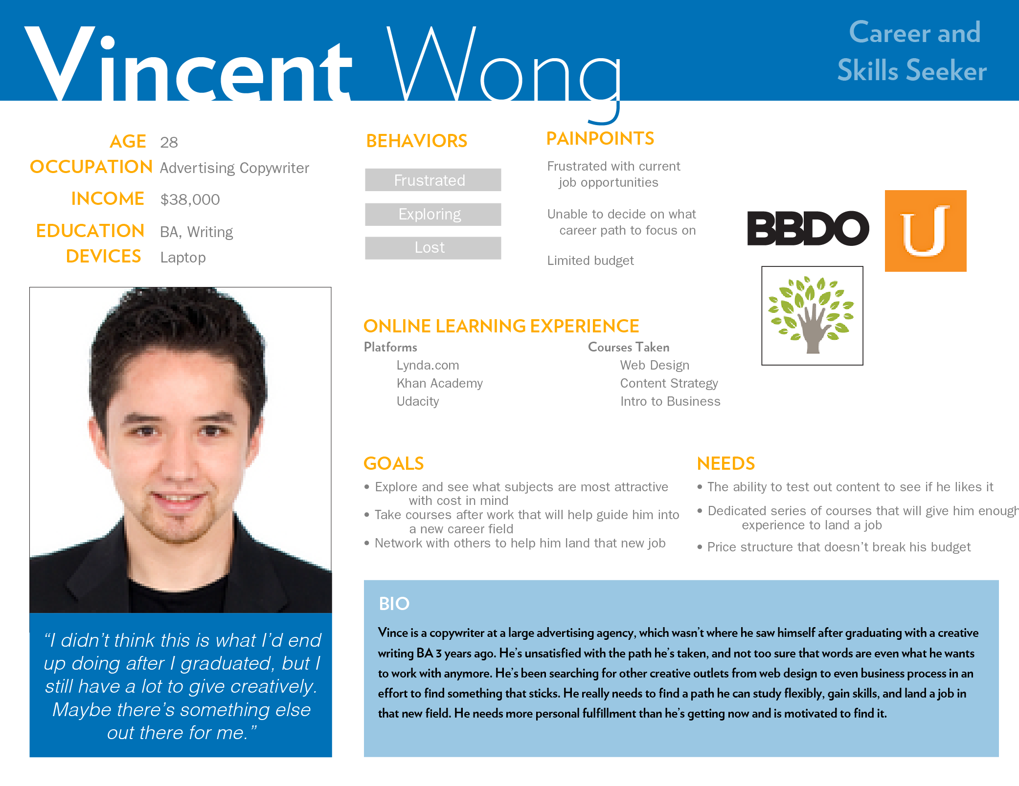
After conducting the research, my team then synthesized all of the data we had collected. As a team, we created an affinity diagram from our user interview data. We then created two primary user personas, Pauline and Vincent.
The User
Based on our research, two primary user personas were created to represent the goals, motivations and behaviors of our target demographic. These personas were used throughout the project to guide design decisions and priorities.
Pauline: the career fast-forwarder, was representative of the young professional who was looking to advance themselves in their current careers.
Vincent: the career and skills seeker, represented the young professional looking to make a career shift.
Going forward, we ensured that our ideas met the needs of both personas. Our design had to offer enough substance to advance someone in their current careers, but be accessible to those looking to get their foot in the door within a new one.

The Problem
Lynda.com’s lack of interactivity both socially and with instructors negatively impacts motivation and decreases how much content is learned.
Design Principles
Before sketching ideas, my group defined 4 design principles that we felt were critical to adhere to in our ideation process.
Personalized: Getting to where you want to go on your own terms means you’ll enjoy it more, stay longer and absorb more of what you want.
Empowering: Give users the tools to take the lead in their education, reaching their professional and personal goals.
Connected: Sharing skills, assets and common interests lets users help each other navigate opportunities and new career pathways
Directional: As users continue to grow in their skills, giving guidance early and often through experts and peers, will help people achieve their goals.
IDEATE-PROTOTYPE-TEST
Design Sprint
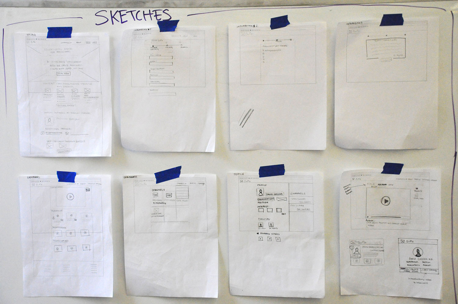
As we starting thinking of potential solutions, my team conducted a Google design sprint in which each member of the team took pencil to paper and sketched out their ideas of potential solutions to the problem statement. After a couple hours spent sketching individually, we came back together and taped our sketches on the wall. We discussed each other’s solutions and created paper prototypes of each idea which we then concept validated.
The sketches were taped to the wall as seen below.

Our Solution
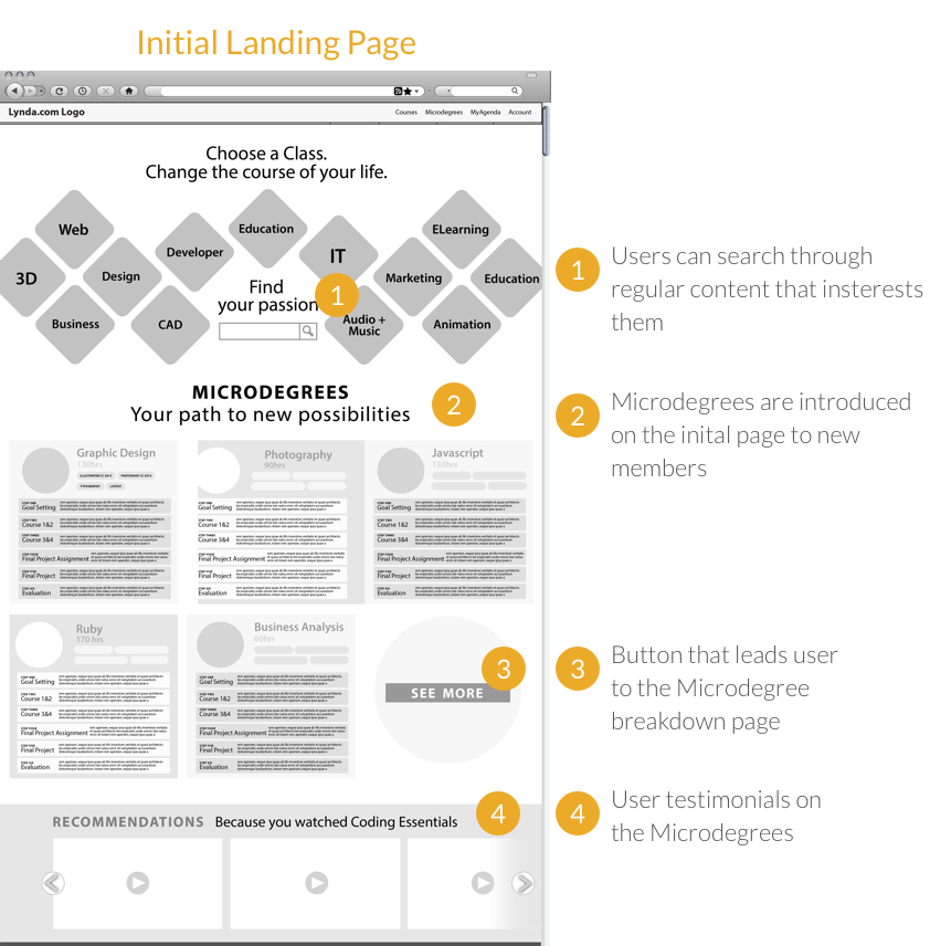
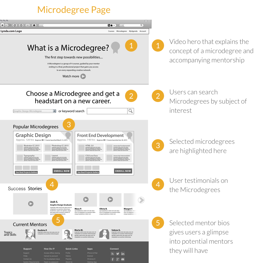
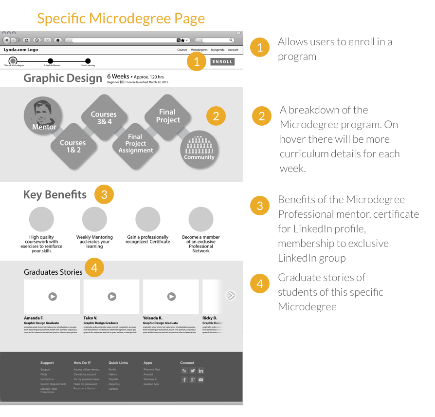
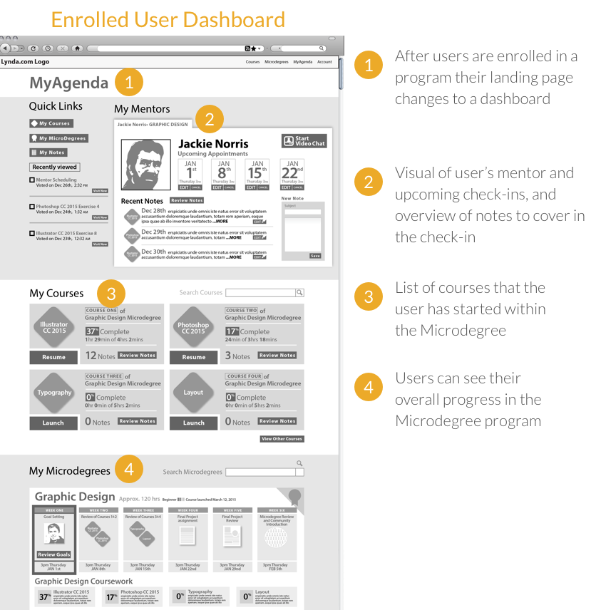
After seeing how each potential solution fared in concept validation, my team came back together and decided to combine the most successful parts of the various ideas. My idea included a "microdegree" concept, where students would complete a specific degree with the guidance of a professional mentor, and Doug's idea involved having a social community feature both in lynda.com and LinkedIn.
We decided that our primary direction was going to be my microdegree concept but we also tied in community features into the idea. Our final solution involved three primary components:

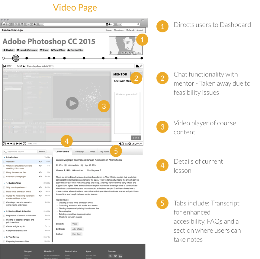
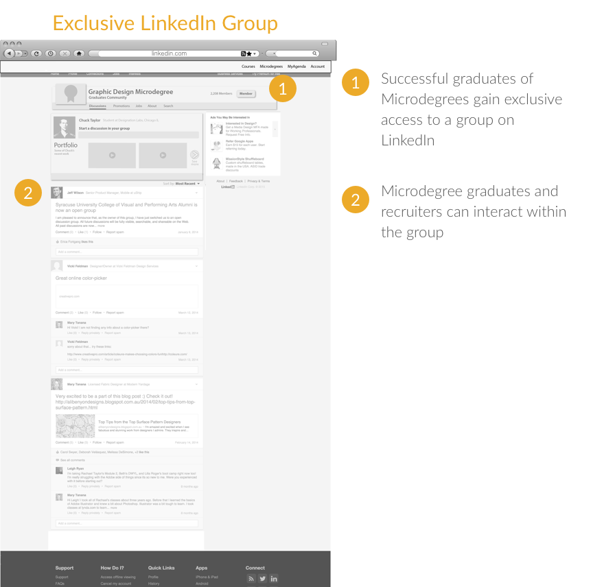
A student would complete a 12 week microdegree with weekly check-ins with a mentor, who is a working professional of the subject being learned. After the student graduated from the microdegree within lynda.com, they would gain access to an exclusive group within LinkedIn, where other graduates are also members, and recruiters would be searching for potential hires.
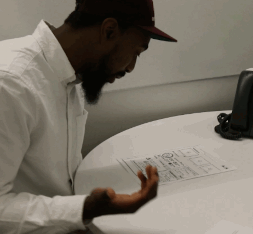
Concept Validation
Initially, we had community features both on LinkedIn and on lynda.com in the form of a chat area. This confused users. Users reported that they preferred the exclusive community of LinkedIn and did not feel a social chat feature within lynda.com was very beneficial when they could direct questions to their mentors.
From this feedback, we removed the social chat features from lynda.com and only kept the exclusive microdegree group on LinkedIn.

Wireframes
After combining the best performing parts of our ideas we created our wireframes. We then took these to usability testing. From there we completed our second iteration, which we also usability tested.

Usability Testing
Users found the website much easier to use once the chat and social functionality was removed from Lynda. The feedback from the usability tests was very positive; users liked having access to a professional mentor and a network within LinkedIn.
The usability tests verified that users were interested in "microdegrees".
The Redesigned User Experience
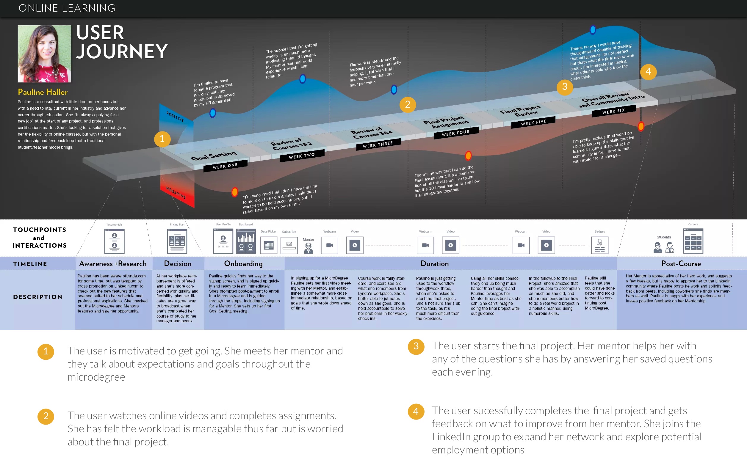
My teammate, Doug, created a customer journey map that showcases the stages of the experience, the touchpoints users have with the product, and their emotional reactions, both positive and negative.

UI
Approach
The UI of the project included rebranding, a redesign and the creation of high fidelity mockup pages.
My approach to visual design, similarly to the UX process, first involved research of competitors, as well as styles that appeal to the defined user groups. I then did an exploration of potential styles through mood boarding and style tiles. After my visual exploration, I decided on a final style to pursue and use for the final high-fidelity mockups.

VISUAL RESEARCH
Visual Competitive Analysis
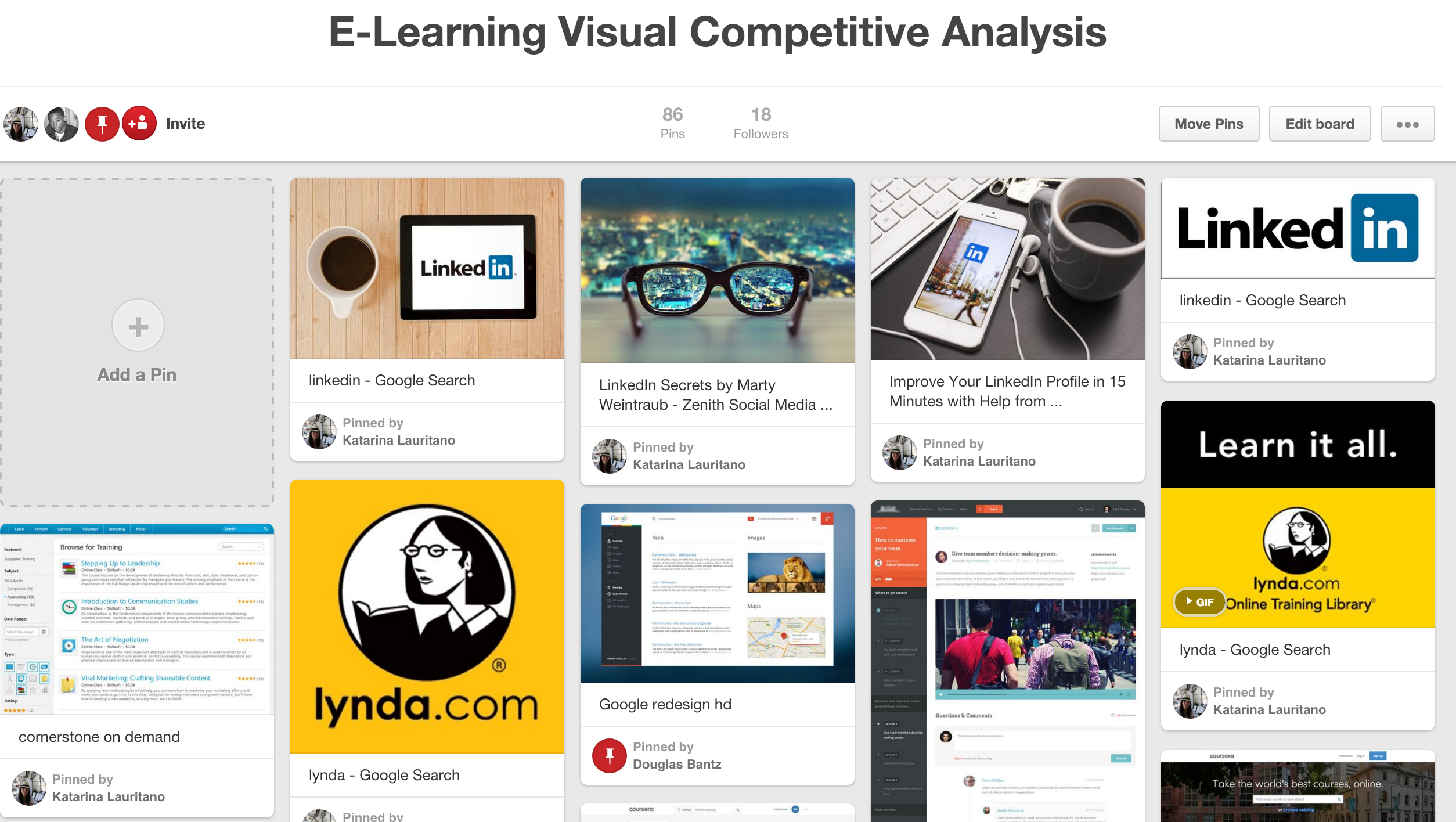
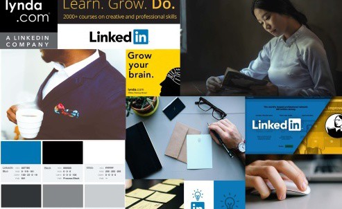
I created a Pinterest board to get an idea of what visual styles competitors in the e-learning space were using, as well as to gain an understanding as to the aesthetics that appeal to the young working professional (the primary persona demographic of Lynda).
I found that competitors to Lynda varied in design from the very colorful and friendly aesthetic of Treehouse, to the muted, clean aesthetic of Coursera. By reading reviews of different services, I found that users commented positively on inviting interfaces that were not overly corporate.

VISUAL EXPLORATION
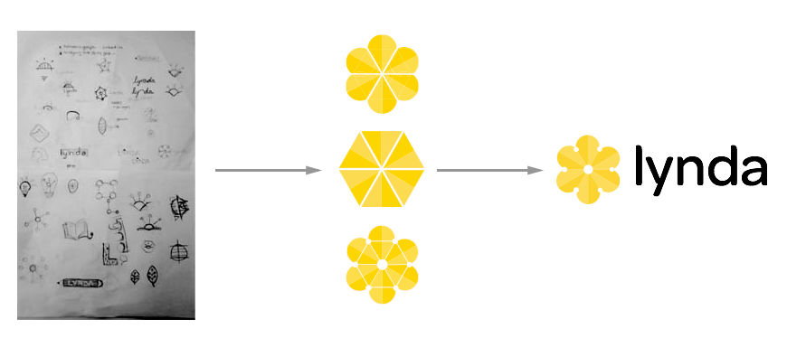
Rebranding
Before starting the high fidelity mockups we were tasked with the redesign of Lynda’s logo. My main objective was to represent the union of Lynda and LinkedIn. The final design symbolized the growth that Lynda offers to its users, through the flower, and the networking and connectedness that LinkedIn provides, through the nodes hidden within the blossom.

Moodboards
After researching visual styles, I created a mood board for inspiration as to a style that would suit lynda.com. My objective with the redesign was to make Lynda feel like it belonged under the LinkedIn umbrella. The various products that LinkedIn has acquired, such as SlideShare and Pulse, have been rebranded with their well-known blue. Through the mood board, I was able to create a broad idea of the colors and treatments I wanted to explore.

Style Tiles
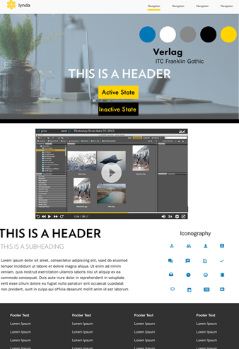
After gaining inspiration from my mood boards, I created two distinct style tiles. The aesthetic that I decided on was one that was in line with LinkedIn's branding while still referencing the original lynda.com through the use of the iconic yellow.

STYLE EXECUTION
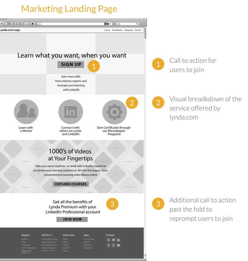
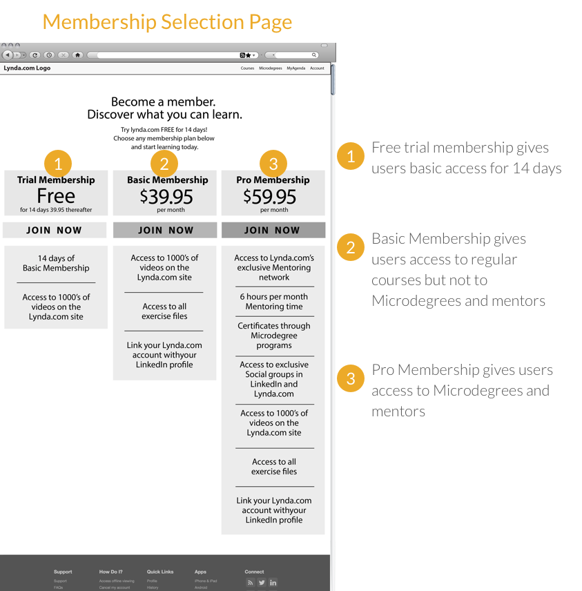
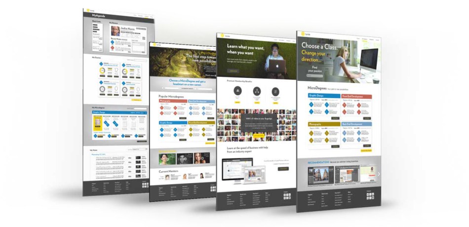
High Fidelity Mockups
After choosing a final style direction, I skinned the wireframes. I applied the aesthetic of the first style tile across all the wireframes. They can be seen in the prototype video at the end of the case study.

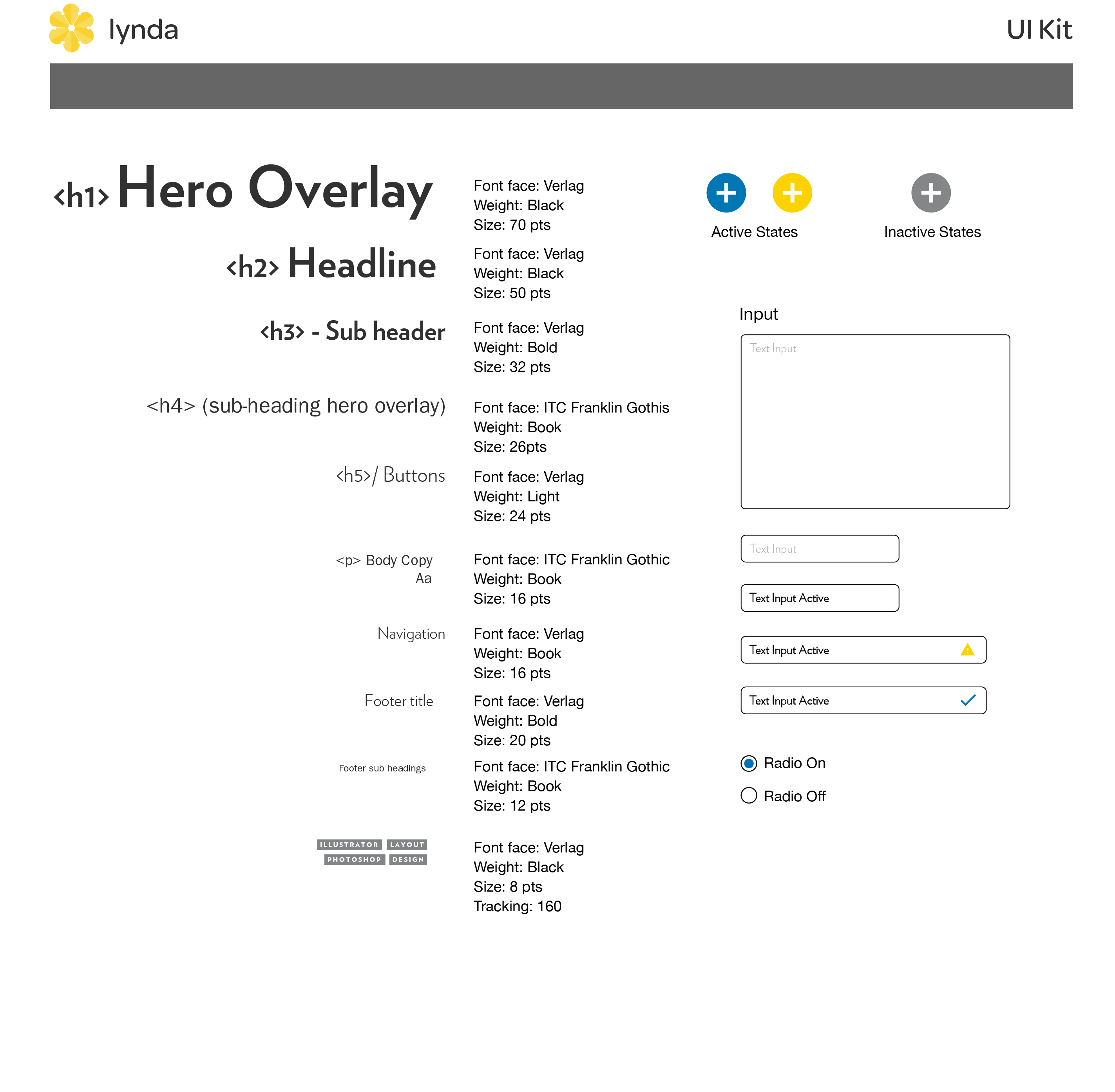
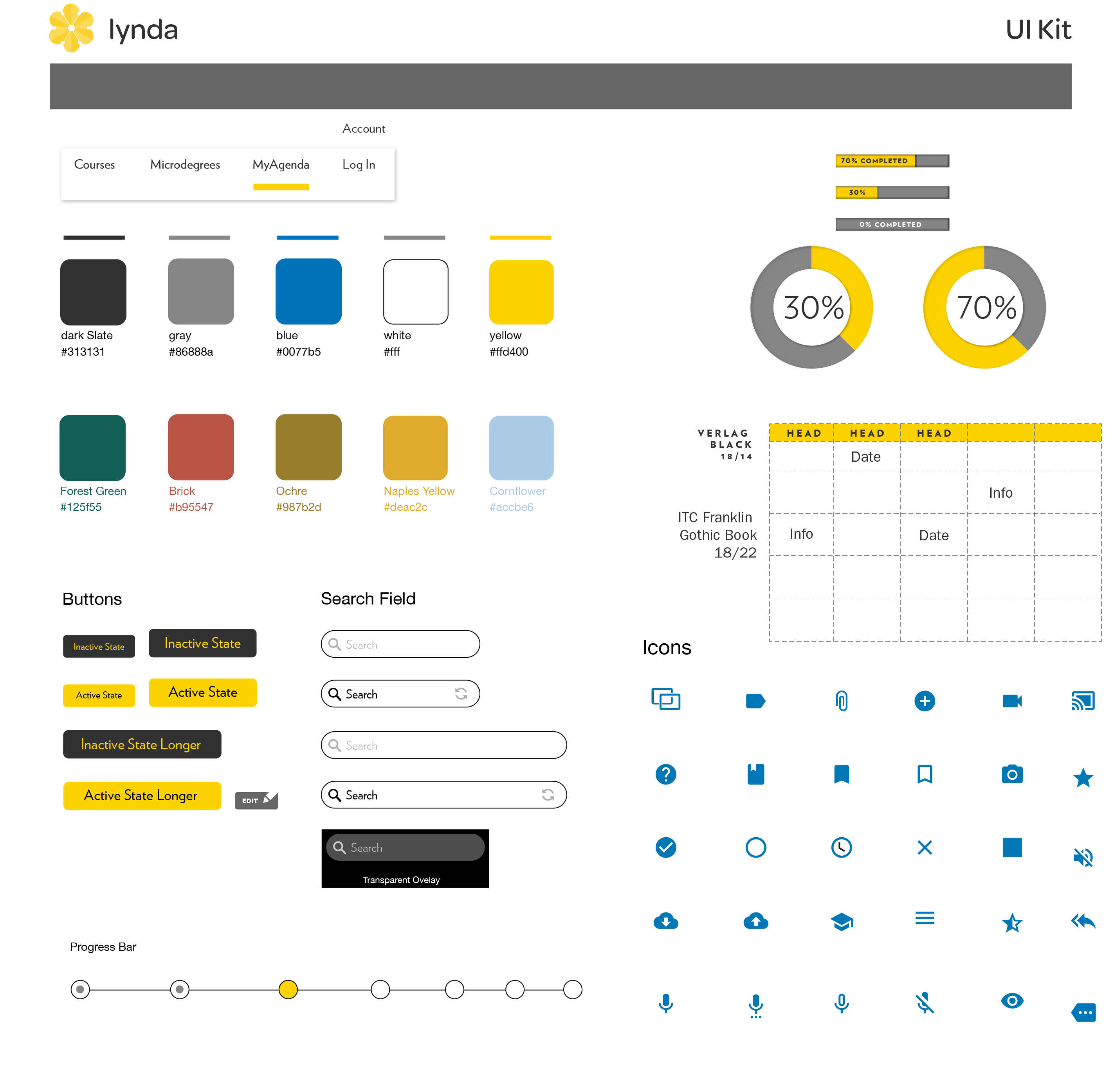
Style Guide and UI Kit
Finally, I created a comprehensive style guide and UI kit that defined the visual design guidelines for our redesign.


Final Prototype
Below is a video of the final prototype built in InVision.
Results and Reflection
The final outcome of this project was positive. Users reacted well to our microdegree and mentorship concept. I learned a lot about the different motivations people have who use online learning.
Seeing the project through from UX to UI was also an experience that gave me practice in making decisions in a more deliberate manner, consciously thinking of the entire design process with each decision. This project allowed me to become much more comfortable with creating prototypes within InVision.


“Design is so simple. That’s why it’s so complicated.” – Paul Rand
© 2021 Katarina Lauritano